Rebrand allows heatpump manufacturer to grow internationally
.webp)
The industrial heat pump manufacturer Thermonova needed a new visual identity to stay competitive and reach new markets. Kvalifik created a new brand identity including a new logo, along with a modern website positioning Thermonova as a market leader in its catagory.
With a bold new visual identity and a modern website, Thermonova now stands out as a premium manufacturer in a competitive market. The rebrand has strengthened their credibility, supported international growth, and positioned them as a serious player in the market.
Increase in page views (comparing 6 month before the website launch with 6 months after)
Thermonova, a Danish manufacturer of high-performance industrial heat pumps, had world-class technology, but their brand didn’t show it. Visually, they looked similar to the industry: red colors, generic fonts, and a logo that blended in rather than stood out. Their website was difficult to navigate, lacked responsiveness, and was only available in Danish - creating friction for potential customers and blocking their international growth. To compete globally and reflect their true innovative edge, Thermonova needed a bold new identity and a modern digital presence.
Kvalifik was brought in to create a full transformation of Thermonova’s brand, visually and digitally. We kicked things off with collaborative workshops to align on Thermonova’s positioning, purpose, and values.
We looked at the competition and defined different visual directions. Based on the chosen direction we crafted a modern visual identity in an iterative process.
The new identity was documented in a detailed brand guide, ensuring consistency across all platforms and materials.
Thereafter, we designed and developed a new multilingual website in Webflow, bringing the brand to life online.


The fluid shape of the logo mark symbolises the fluid motion inside the machine and the modularity of the product. It is derived from the product’s characteristic pattern.

“Friendly, proficient and responsive, Kvalifik’s intellectually curious approach shines through in delivering creative brand identity design and digital projects. They are a standout choice for a digital agency partner."

Website design


Kvalifik did 3D renders, to show of the products from it’s best angle and effectively highlight their advanced features.

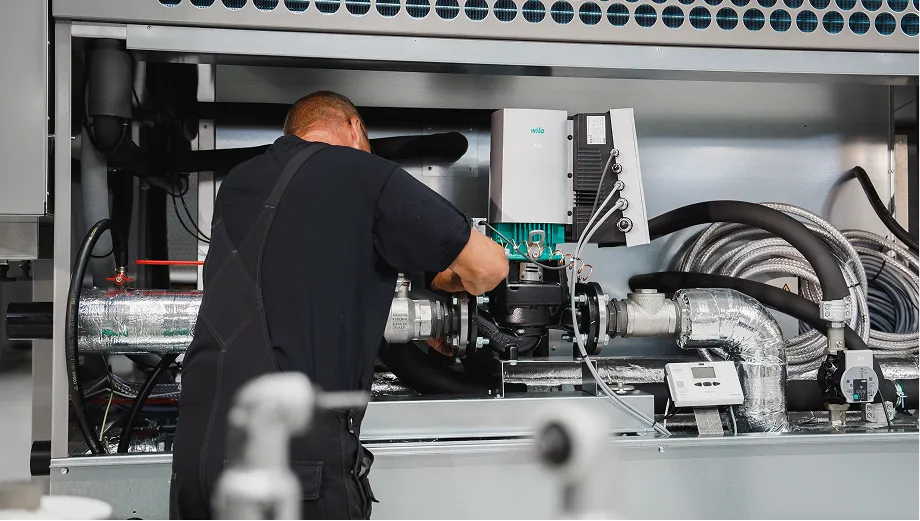
New photography shows the craftmanship that goes into manufacturing Thermonova’s products in Aars.