Brand identities
Brand identity that carries the strategy everywhere you show up
A brand identity is the visual system that carries your strategy everywhere your brand shows up. Logo, color, type, illustration, and the assets and templates your team uses every day.
By Rebecca Busk, CEO & Partner
Last updated: June 2026
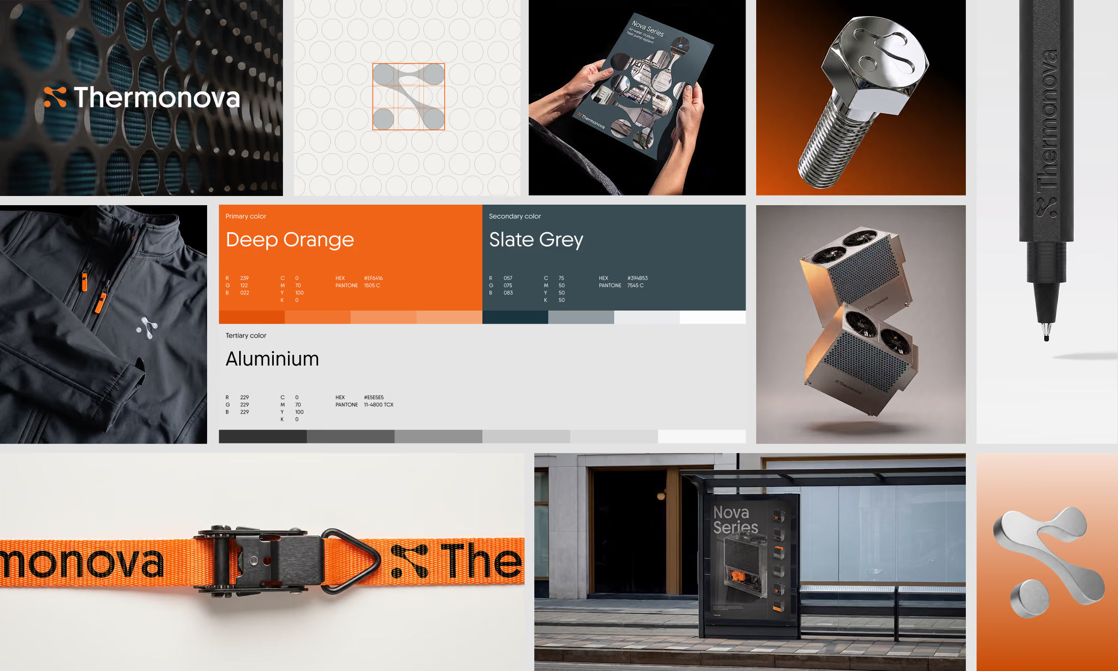
Good brand identity means your team can make anything look like you, without calling a designer.
We design the system, not only the logo. Every element is built to work on a website, a sales deck, a trade show wall and a social post.
We hand it over as guidelines and working templates, so the identity survives contact with your team.
What is a brand identity?
A brand identity is the complete visual and verbal system that makes your brand recognizable. The logo is the smallest part of it. The rest is color, typography, illustration, imagery style, layout principles and the assets that carry them, from the website to the sales deck.
A good identity does two jobs. It expresses the strategy, so people understand who you are without reading the about page. And it scales, so your team can produce new material that still looks like you a year later.
That second job is where most identities fail. They look great in the presentation and fall apart in the third PowerPoint. We design for the third PowerPoint.
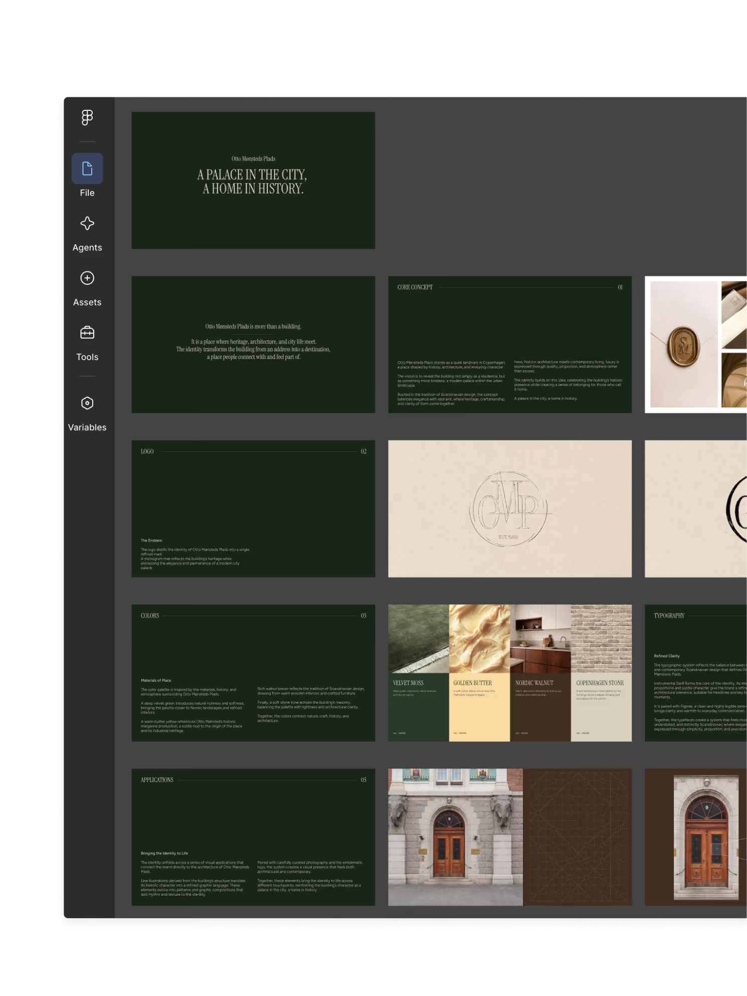
Who is this for?
Companies building a brand for the first time, companies whose identity has drifted across a dozen freelancers, and scale-ups whose look no longer matches their size. You'll recognize at least one of these.
- 01You have a logo and not much elseEvery new piece is designed from scratch, and none of them look like they came from the same company.
- 02The identity lives in one designer's headWhen they're on vacation, nothing ships. When they leave, the brand goes with them.
- 03You look like a startup and sell like an enterpriseThe product grew up. The brand still looks like the pitch deck from the seed round.
- 04Your website and your sales deck are two different brandsColors drift, type changes, and customers notice even when they can't say what's wrong.
If two of these sound familiar, an identity audit shows you what's worth keeping and what's holding you back, before you commit to a full project.
A template or a real system?
Templates | A real system |
|---|---|
A logo file and a color code, applied by whoever is available. | Logo, color, type, illustration and layout rules that fit together and are designed to be used. |
Works for the website. Breaks on the deck, the trade show wall and the app. | Built for every surface you actually use, and tested on them before handover. |
Guidelines nobody reads. | Guidelines and working templates your team uses without asking, because they are faster than starting over. |
An identity is only as good as its worst application. We design the system so the hundredth piece your team makes looks as sharp as the first one we made.

What's included in a brand identity
A visual system your team can actually use
- LogoA mark and wordmark that work at every size, in every color mode, and next to your partners' logos.
- Visual identityColor, typography, imagery style and layout principles, designed as one system rather than a set of parts.
- IllustrationA custom illustration style and icon set, so you never depend on stock that looks like everyone else's.
- Brand assetsThe files your team reaches for every day, from social frames to email signatures, ready to use.
- GuidelinesClear rules with examples of right and wrong, written for the people who will use them rather than for designers.
- TemplatesDeck, document and social templates built in the tools you use, so on-brand is the path of least resistance.
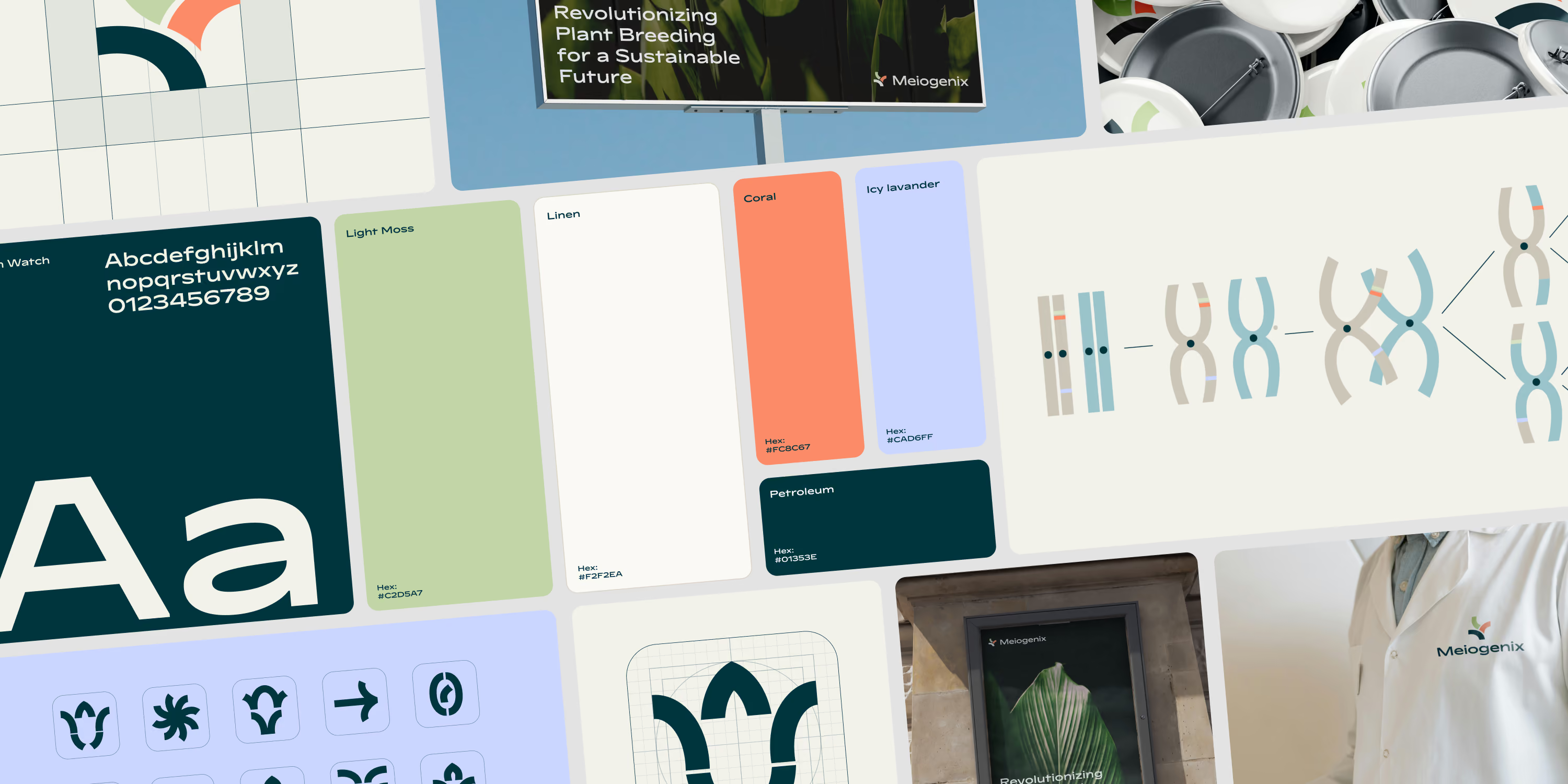
How we work
Four steps, no mystery
- 01BriefWe start from the strategy. If there isn't one, we run a short positioning session first, so the identity has something to express.
- 02ExploreTwo or three directions, shown on real surfaces like your homepage and a sales deck rather than on a blank canvas.
- 03Build the systemWe take the chosen direction and design every element, then stress-test it on the pieces your team makes most.
- 04Hand overGuidelines, templates and assets, plus a working session with your team so the system runs without us.
74%
faster recall from creative visuals
Canva, 2025
+21%
report stronger emotional response
Canva, 2025
61%
report sharper brand differentiation
Canva, 2025
65%
average consistency across brand portfolios
Ward et al., 2026
Questions
A brand identity is the visual and verbal system that makes a brand recognizable across every touchpoint. It includes the logo, color palette, typography, illustration and imagery style, layout principles, tone of voice, and the guidelines, assets and templates that let a team apply all of it consistently. It is the expression of the brand strategy, which decides what the identity should say.
The logo is the part people notice first, and the part that does the least work. Most of what makes a brand recognizable is everything around it. Color, type, layout, illustration and imagery decide whether a page reads as yours before anyone sees the mark. That is why we design the system, and the logo as one element of it.
It helps a lot. An identity is an expression of something, and if nobody has decided what, the design reviews become taste debates. If you have a strategy, we start from it. If you don't, we run a short positioning session before the design work, so there is a brief to judge against. See how we run brand strategy.
Typically six to ten weeks from brief to handover, depending on how many surfaces the system has to cover and whether illustration is part of it. We show directions on real applications early, so decisions happen fast and the last weeks go to building the system, not debating the logo.
Yes. If the mark is strong and recognized, we keep it and build the system around it, sometimes with a light refinement so it holds up at small sizes and in dark mode. Throwing away recognition to get a new logo is rarely the right trade, and we'll tell you if we think it is. If the whole brand needs to move, read about rebranding.
The logo in every format, the full visual system, illustration and icons where scoped, brand guidelines with examples of right and wrong, a library of ready-to-use assets, and templates for decks, documents and social built in the tools you use. Plus a working session with your team so they can run it without us.
That is the point of the templates and the guidelines. A marketer should be able to make a deck, a social post or a one-pager that looks right without opening a design tool. We test the system on the pieces your team makes most, and we fix what's awkward before handover instead of leaving it to you.
Yes, and it is usually the first place the identity has to prove itself. We design and build websites in Webflow, so the visual system becomes a design system your team can publish with, rather than a PDF the developers interpret. If you keep the site elsewhere, we hand over a web-ready version of the system to your developers. More on our Webflow development.
Got a project
or a problem you can’t crack?
or a problem you can’t crack?
Tell us where it hurts.
We'll give you a straight answer, even if it's not us.
We'll give you a straight answer, even if it's not us.
Let's talk