Digital experience design
Digital design that makes the next step obvious
Digital experience design is the research, UX and UI work that decides how people move through your website or product, so they find what they came for and take the next step without thinking about it.
By Rebecca Busk, CEO & Partner
Last updated: June 2026
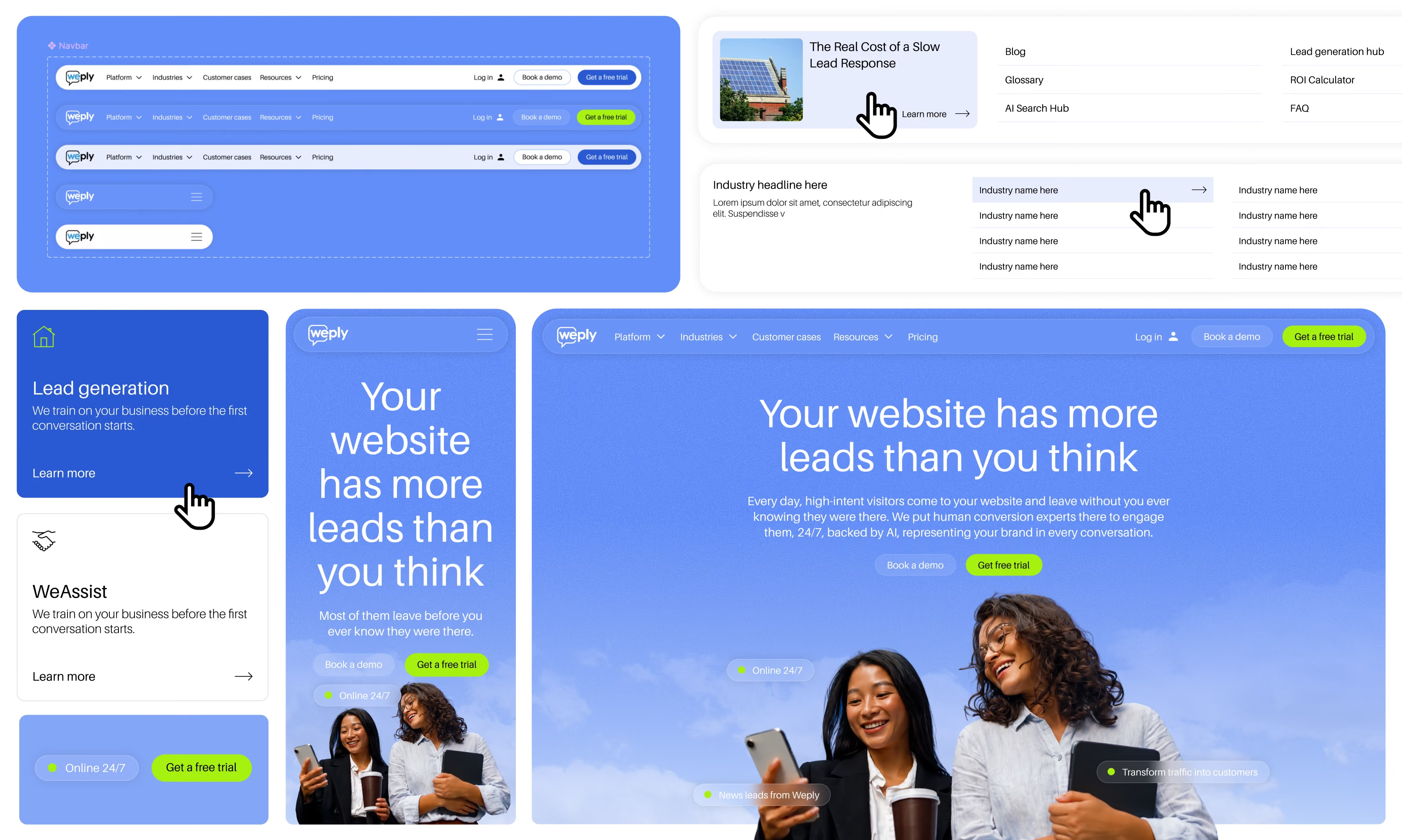
Good experience design means people get where they're going, and your business gets the outcome it built the site for.
We start with how people actually use your site, from analytics and research, before we draw a single screen.
We design in systems, so every new page your team builds looks and works like the ones we designed.
What is digital experience design?
Digital experience design is the discipline of shaping how people experience your website or product, from the first click to the goal. It combines user research, information architecture, UX flows, UI design and a design system that keeps it all consistent as the site grows.
It is different from visual design alone. A beautiful page that leaves people unsure what to do next has failed at the job. Experience design starts from intent, what the visitor is trying to do, and removes everything between them and doing it.
The result is a site that is easier to use, easier to trust, and easier to extend, because the decisions are made once in the system rather than page by page.
Who is this for?
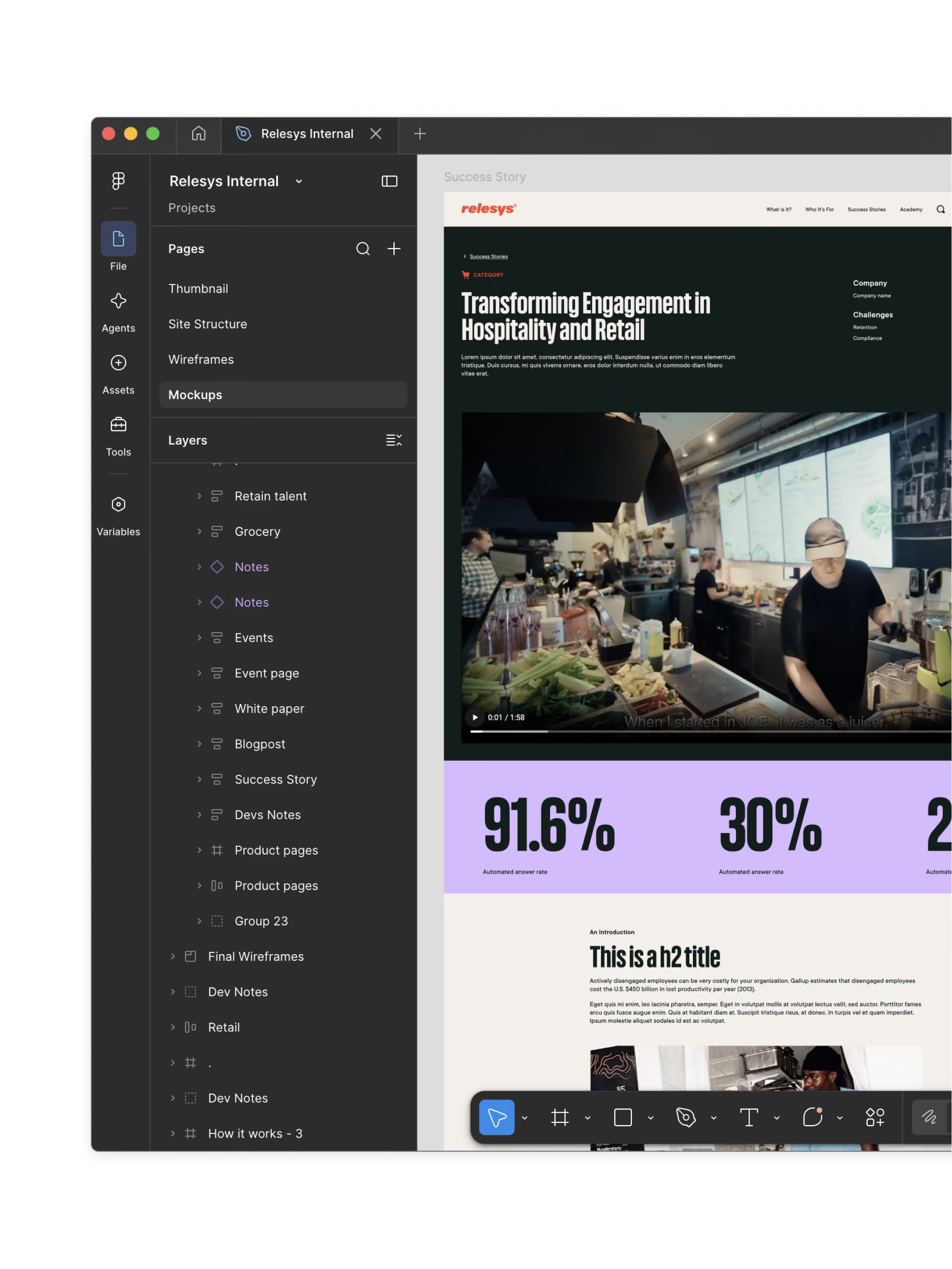
Teams whose site looks fine and still underperforms, and teams about to build something new who want it designed around users rather than around the org chart. You'll recognize at least one of these.
- 01Visitors don't know where to goThe navigation mirrors your departments, not their questions, so people bounce before they find the right page.
- 02Every page is designed from scratchNothing shares a pattern, so the site feels like five different sites and takes forever to extend.
- 03It looks good and converts badlyThe design won the internal vote. The data says people leave at the form.
- 04You're building a product or portalSignup flows, dashboards and self-service tools need real UX work, not a marketing template stretched to fit.
That's scale-ups, marketing-led companies, and organizations with a product or portal that has outgrown its first design.
If what you actually need is a visual refresh with no change to structure or flows, we'll say so, and scope it as a brand identity job instead.
If what you actually need is a visual refresh with no change to structure or flows, we'll say so, and scope it as a brand identity job instead.
What's the difference between UX, UI and a design system?
The three get used interchangeably. They are different jobs, and a good site needs all three.
UX design | UI design | Design system |
|---|---|---|
Decides how the site is structured and how people move through it. Research, information architecture, flows and wireframes. | Decides how it looks and feels on the screen. Layout, typography, color, components and interaction details. | Turns the decisions into reusable parts, so your team can build new pages that look and work right without a designer. |
We do all three, in that order. Structure before surface, and a system before the second page, so the site holds together long after we've left.
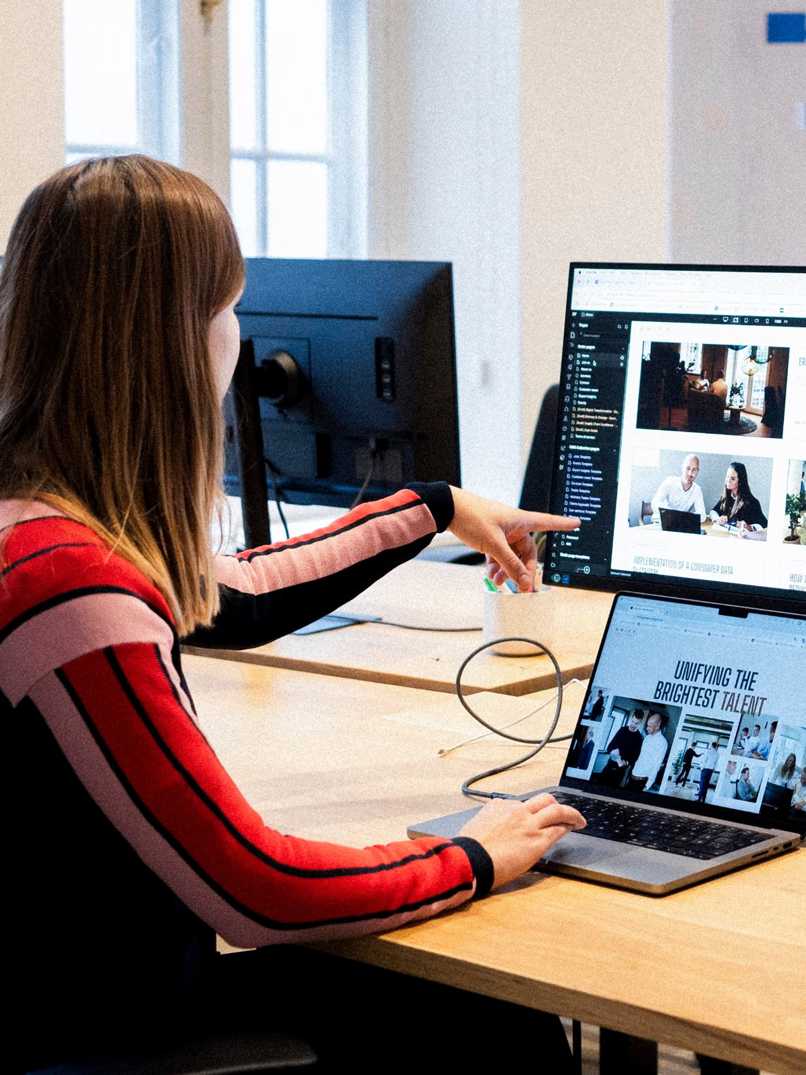
What's included in experience design
From research to a system your team can build with
- User researchInterviews, analytics and session recordings, so the design is based on what people do rather than what we assume.
- Information architectureSitemap, navigation and page structure built around the questions visitors arrive with.
- UX flows and wireframesThe paths from landing to goal, mapped and tested before anything is styled.
- UI designLayout, typography, color and components, designed on real pages with real content and ready to build.
- Design systemReusable components and rules, built in Webflow or Figma, so every new page is on-brand by default.
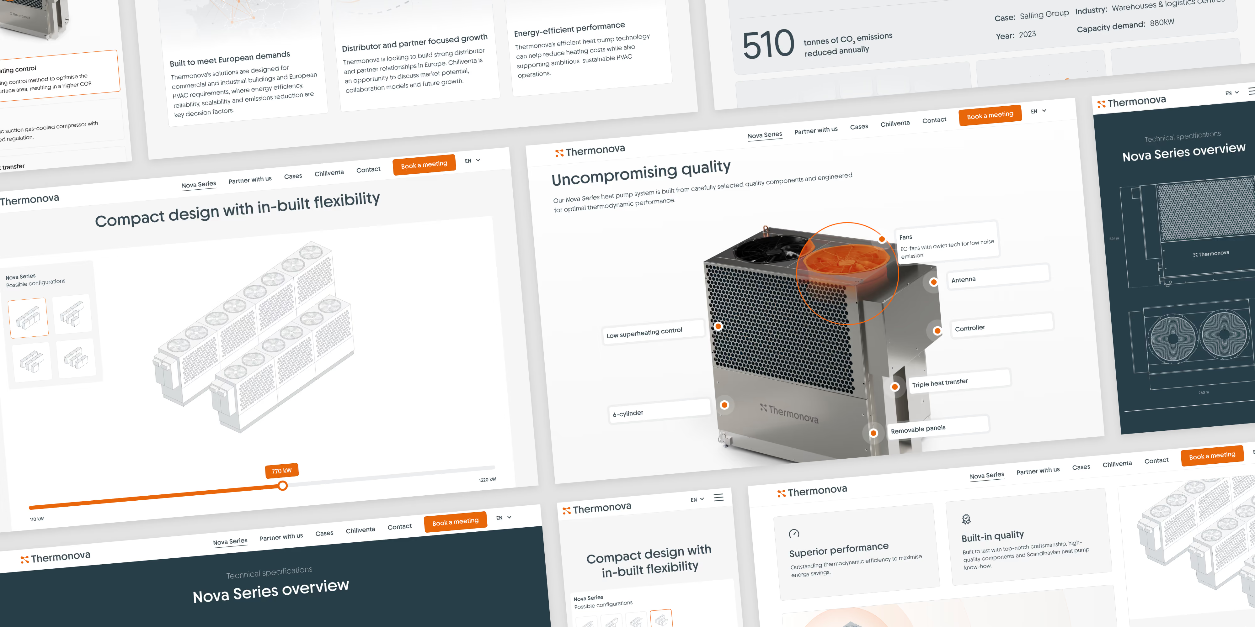
How we work
Four steps, no mystery
- 01ResearchWe learn who uses the site, what they came for, and where they give up today, from the data and from talking to them.
- 02StructureSitemap, navigation and flows, tested as wireframes before any design, so we argue about the right things first.
- 03DesignUI design shown on real pages with real content, built from the components that will become the system.
- 04Build the system and hand overWe build the design system in Webflow, or hand it to your developers in Figma, and train your team to extend it.
Questions
Digital experience design is the practice of shaping how people move through and interact with a website or digital product, from the first visit to the goal. It combines user research, information architecture, UX flows, UI design and a design system, so the result is easy to use, easy to trust and consistent as it grows.
UX design decides how the site is structured and how people move through it. Navigation, flows, what goes on which page and in what order. UI design decides how it looks and feels on the screen. Layout, typography, color, components and interaction details. UX without UI is a wireframe. UI without UX is a pretty page nobody can use. We do both, in that order.
We work from both. Your team knows the customers, the objections and the questions sales gets every week, and we start there. Then we check it against what people actually do, through analytics, session recordings and a handful of interviews. It rarely takes long, and it settles the debates that otherwise eat the design phase. More on brand strategy.
Both. We explore and align in Figma, and we build the design system in Webflow when that is the platform, so the design and the live site never drift apart. If your developers build elsewhere, they get a complete Figma system with specs and states instead of a folder of screens. See our Webflow development.
Yes. A signup flow, a pricing page, a product configurator or the navigation alone are all common scopes. We still start from research and a short structure phase, because fixing one flow without knowing where people come from tends to move the problem rather than solve it.
We set the goal before we design, whether that is conversions, task completion or fewer support tickets, and we measure it after launch. Where the traffic allows, we test. On Veo's homepage, sport-specific content converted 17% better than generic content, and that came from a test rather than a hunch. Read how we run conversion optimization.
Yes, from the start rather than as an audit at the end. Contrast, focus states, keyboard navigation, readable type and sensible structure are design decisions, and they are cheaper to get right in the system than to retrofit page by page. When we rebuilt Pædagogernes Pension's site for 125,000 members, the accessibility score went from 81 to 92.
A focused flow or section takes a few weeks. A full website experience, from research through a built design system, typically runs six to twelve weeks depending on the number of page types and how quickly decisions get made on your side. We scope it after the first call so the timeline is agreed before we start.
Think we
might be a [[fit]]?
might be a [[fit]]?
Tell us where it hurts.
We'll give you a straight answer, even if it's not us.
We'll give you a straight answer, even if it's not us.
Let's talk