
- Søren Højland Boesen (Former Employee)
- Anja Johansen
Because the old one was a bare-bones, hardcoded HTML page with no styling, no real design and not even a logo. It reflected neither Bergiafonden's history nor its ambitions, and it did nothing to make the application process easier. So the job was twofold. Give the foundation a visual identity, and build a website that actively helps applicants.
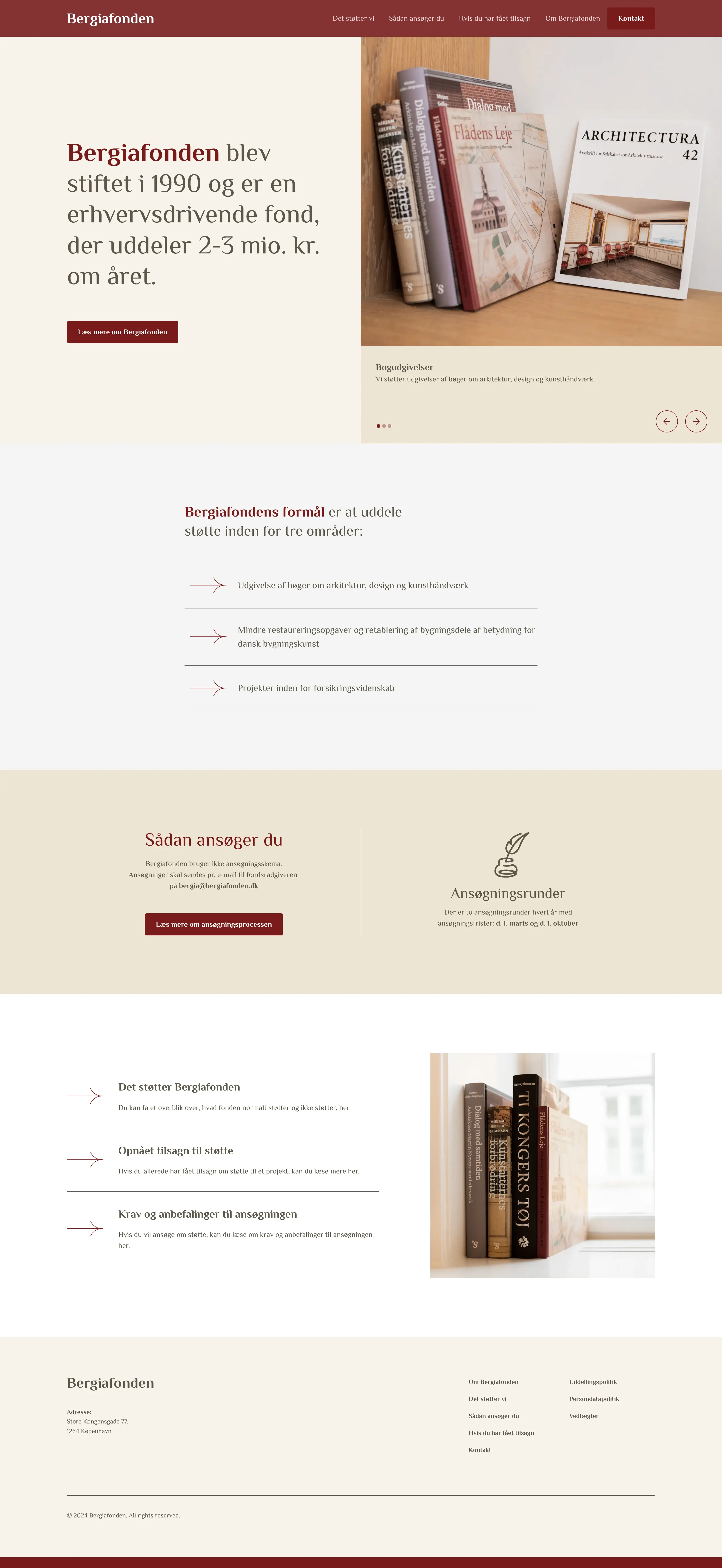
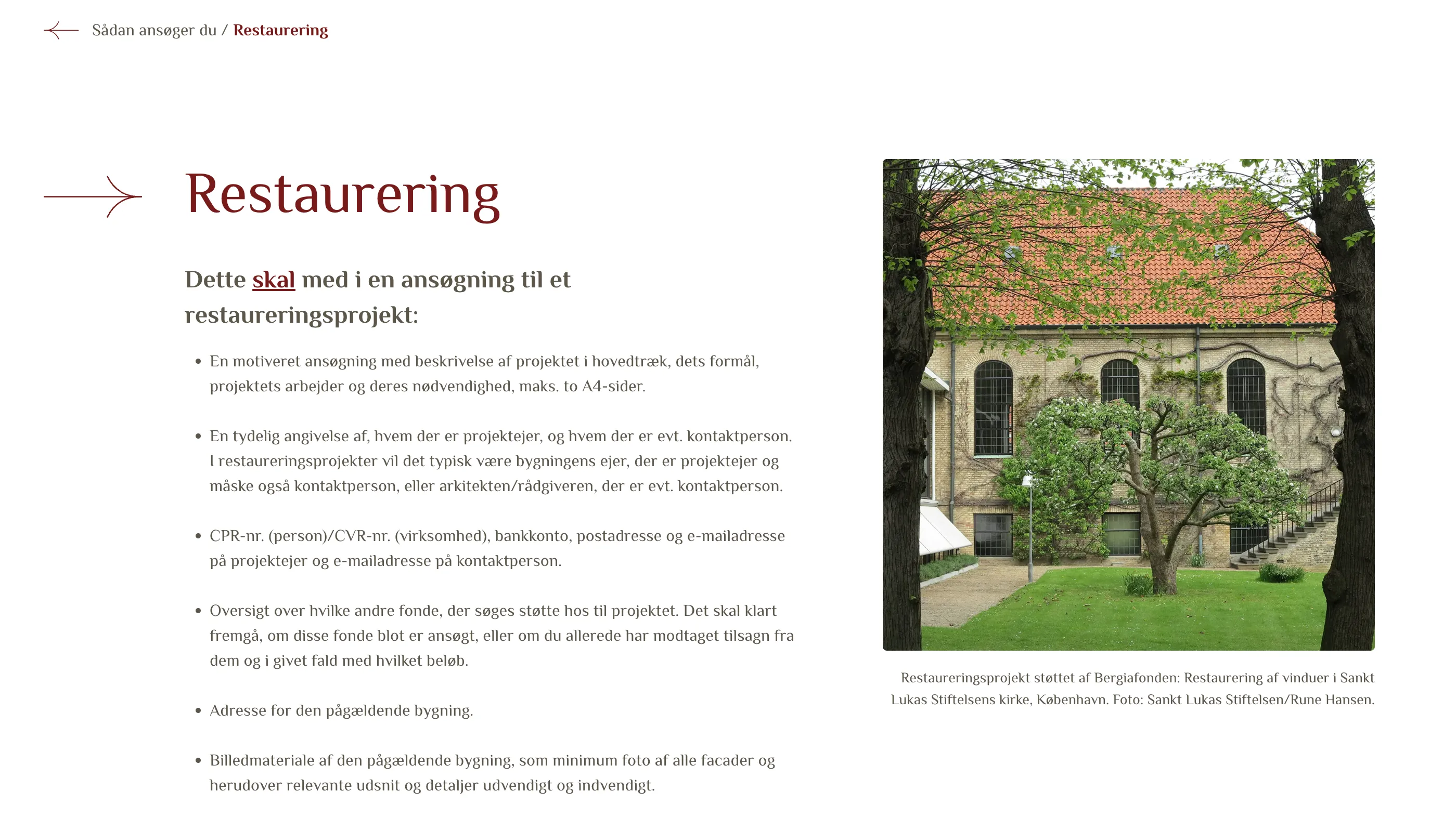
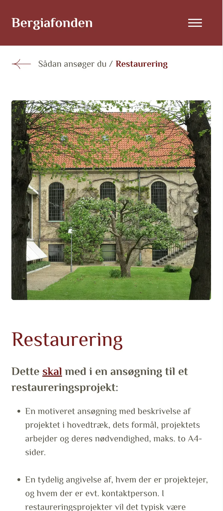
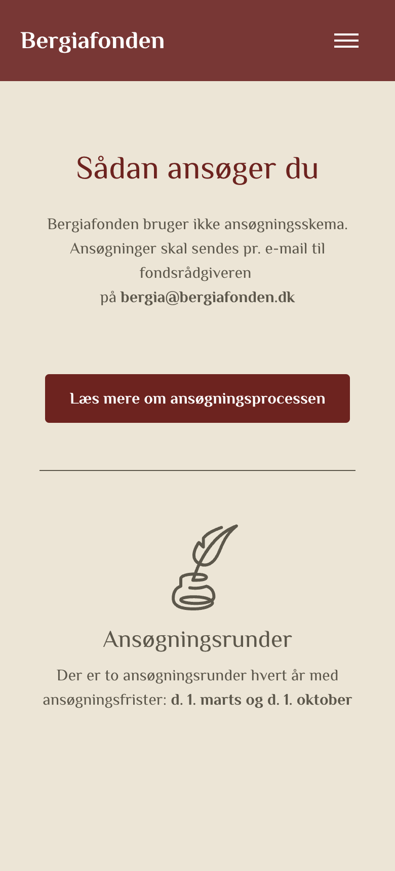
By starting with what applicants need to know. In the opening workshop with Bergiafonden, it quickly became clear that the website's most important job was to support applicants. So we gave dense, practical information a clear structure that shows everything the foundation supports and explains the requirements. The look is warm and modern, and classic enough to feel trustworthy.
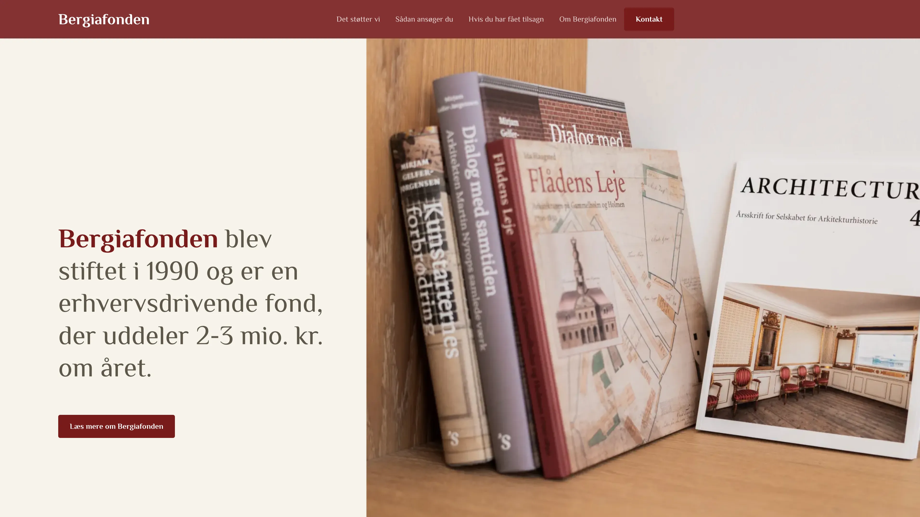
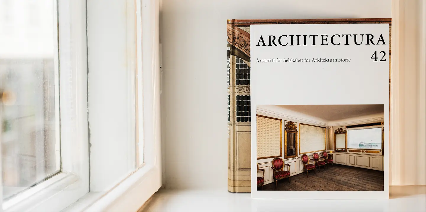
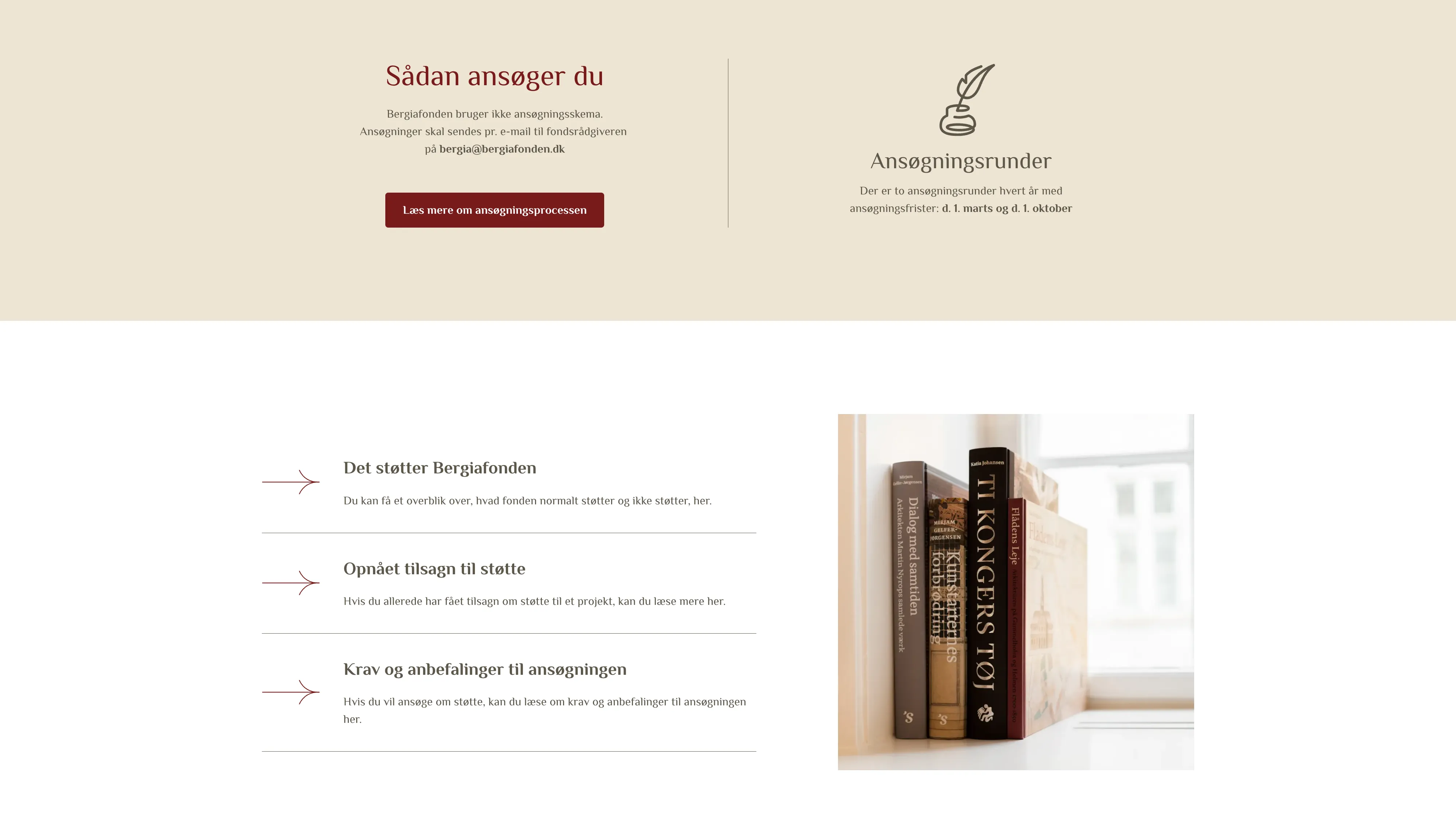
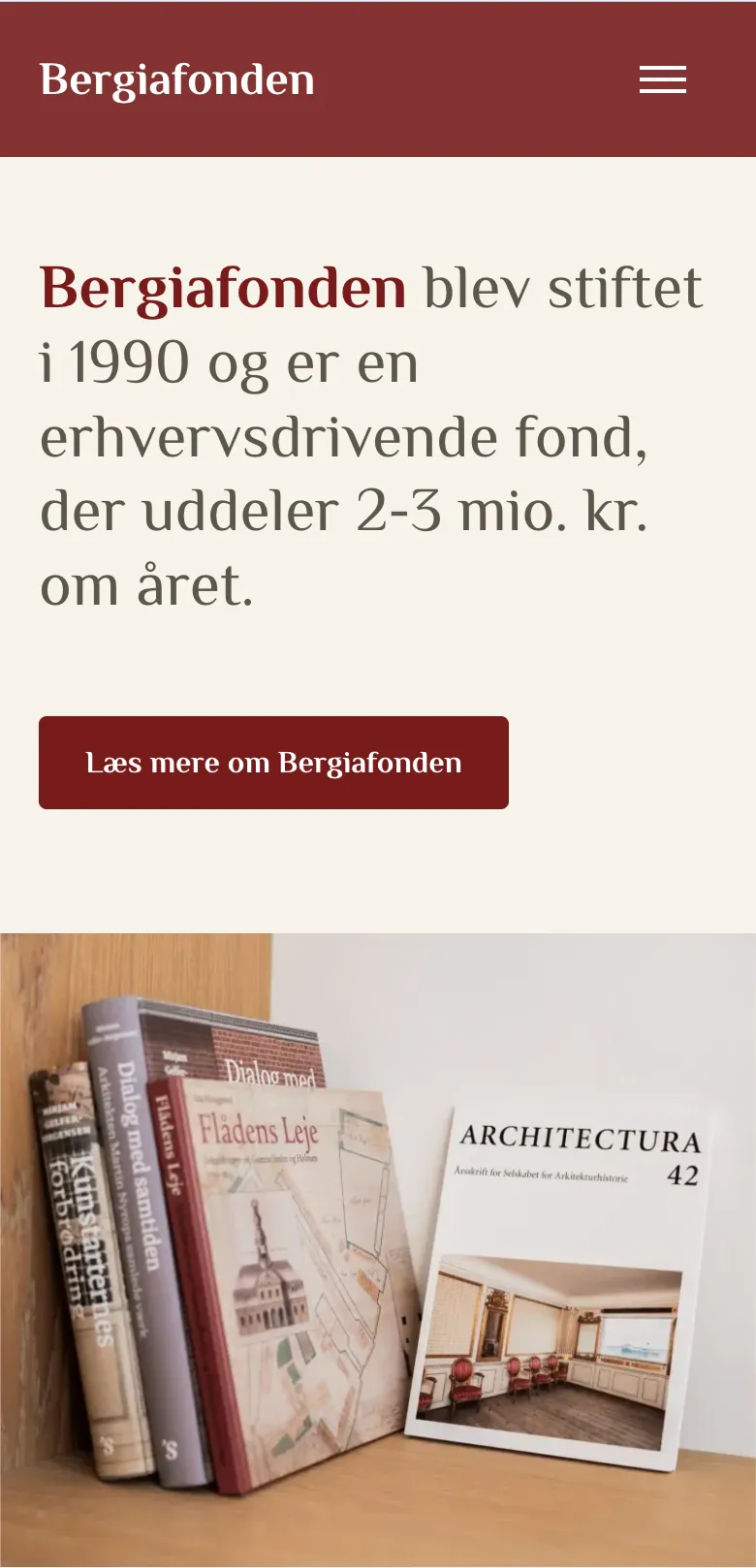
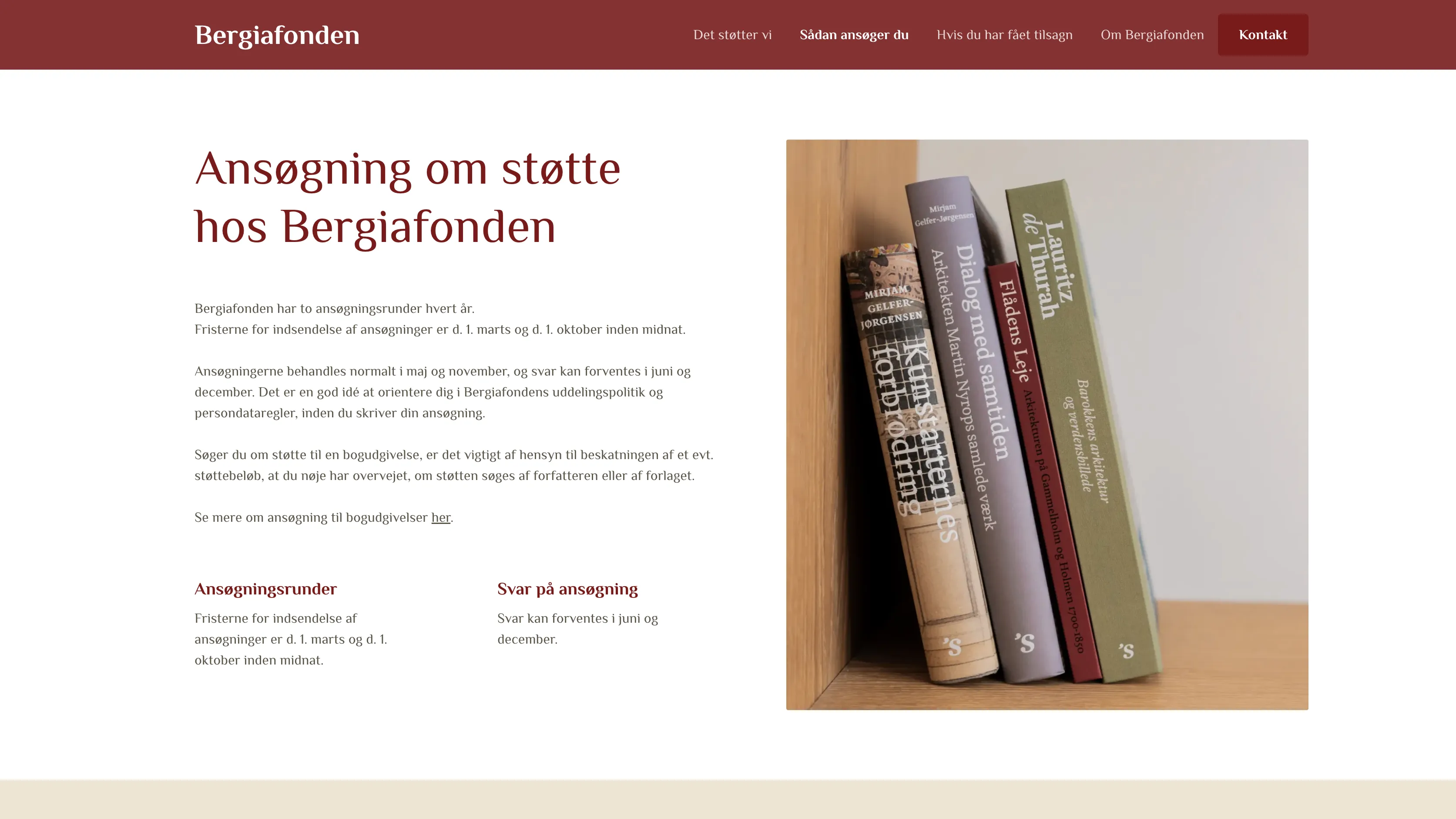
To show what Bergiafonden's support actually leads to. Alongside design and development, we photographed selected book publications within architecture, art and craftsmanship that the foundation has supported. The pictures give the website a tangible, human element and show the cultural value of the projects Bergiafonden funds.
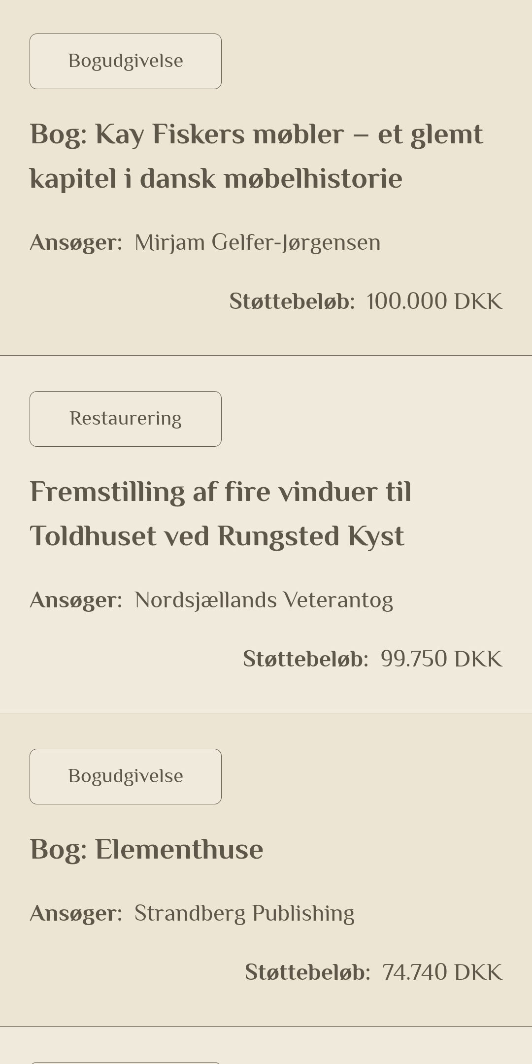
Bergiafonden now gets fewer incomplete or misaligned applications and has a smoother review process. The calm, modern website makes the application process clearer and more inviting, which gives the foundation a stronger pool of applicants who are better prepared and more relevant to its mission. And unlike the old hardcoded page, the new site is easy for the foundation to maintain.

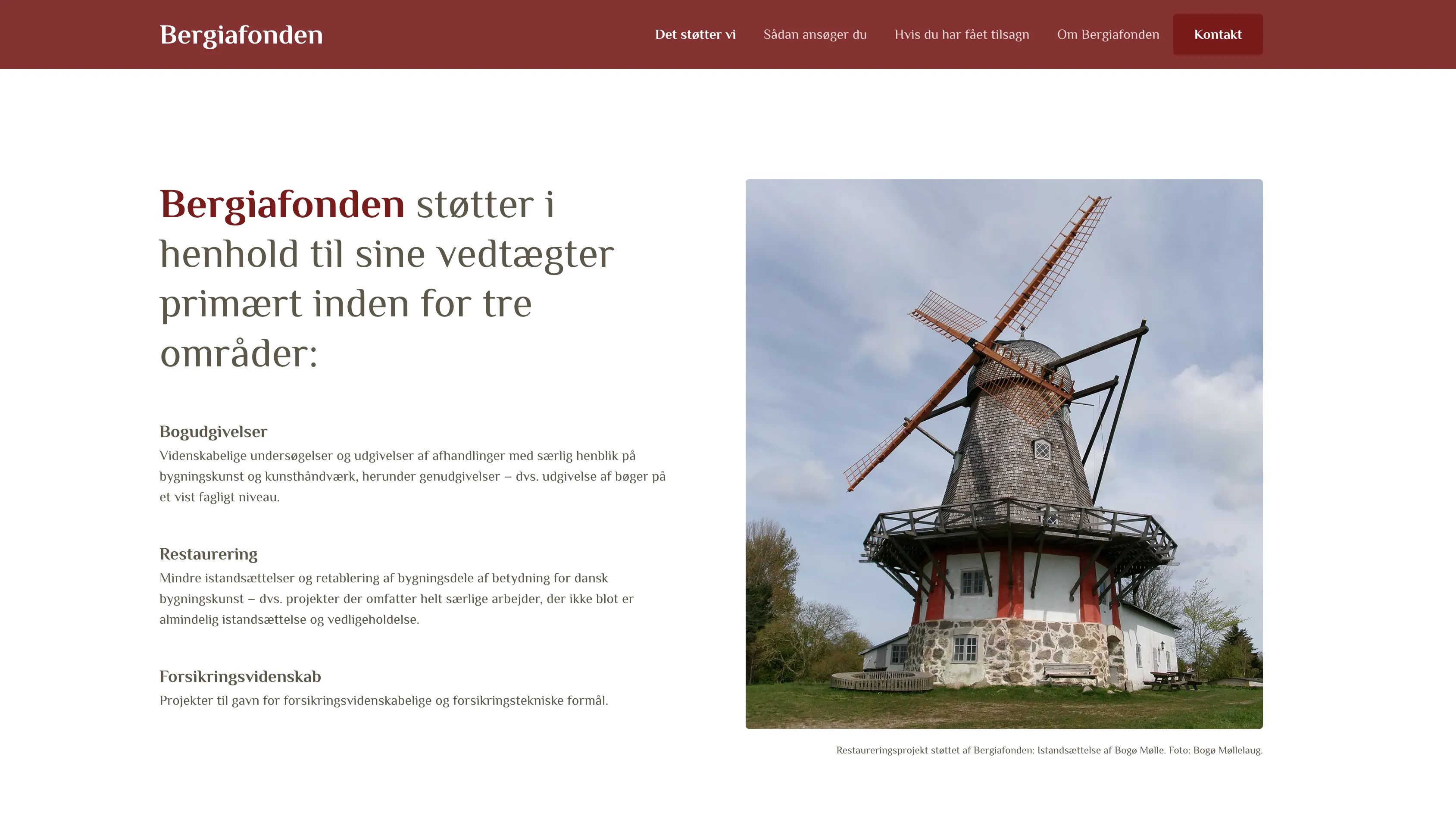
Bergiafonden is a Danish foundation that supports book publications within architecture, art and craftsmanship, restoration projects, and projects within insurance science.
We did a complete redesign and went from a hardcoded HTML page to a contemporary website that is easy to maintain and attracts better applicants.
With Bergiafonden’s new site, we’ve created a calm and modern digital home that makes the application process clearer and more inviting. Applicants can now easily see an overview of everything the foundation supports, understand the requirements, and prepare the right materials.
For Bergiafonden, this means fewer incomplete or misaligned applications, a smoother review process, and ultimately a stronger pool of applicants who are better prepared and more relevant to the foundation’s mission.
When Bergiafonden came to us, their website was a bare-bones, hardcoded HTML page with no styling, no real design, not even a logo. It reflected neither the foundation’s history nor its ambitions, and it certainly didn’t make the application process easier for potential applicants.
The challenge was twofold. Bergiafonden needed a visual identity, and we had to design a website that would actively support applicants. That meant turning dense, practical information into a clear structure, making it simple for applicants to understand requirements, prepare the right materials, and ultimately submit stronger, more relevant applications.
The project began with a workshop to uncover Bergiafonden’s goals and wishes. It quickly became clear that the website’s most important job was to actively support applicants. Together, we explored several design directions and landed on a warm, modern look that felt both classic and trustworthy.
Alongside the design and development, we carried out a photoshoot of selected book publications supported by Bergiafonden. These images added a tangible and human element to the site, highlighting the cultural value of the projects the foundation funds.
Close collaboration throughout the process ensured that the final solution aligned with Bergiafonden’s vision and gave applicants a smoother, more rewarding experience.

See other cases