A luxury brand identity for a historic building
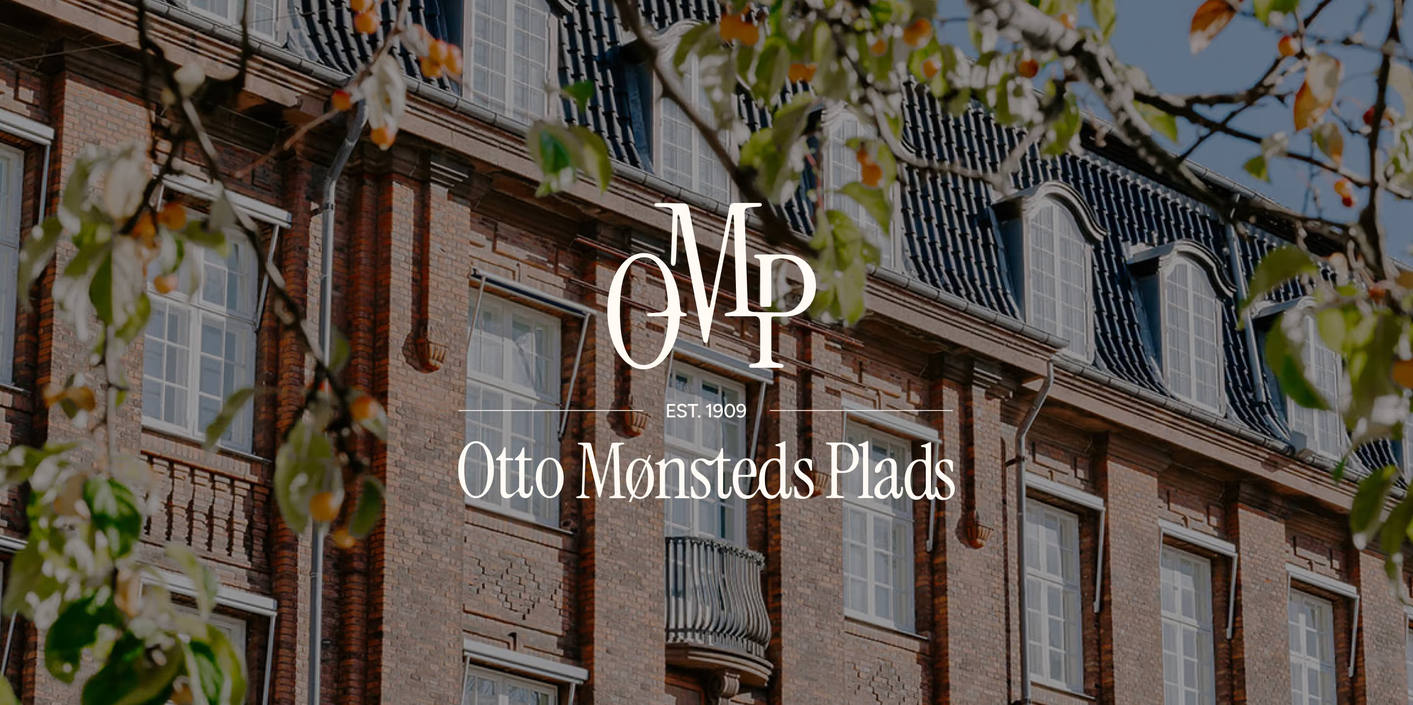
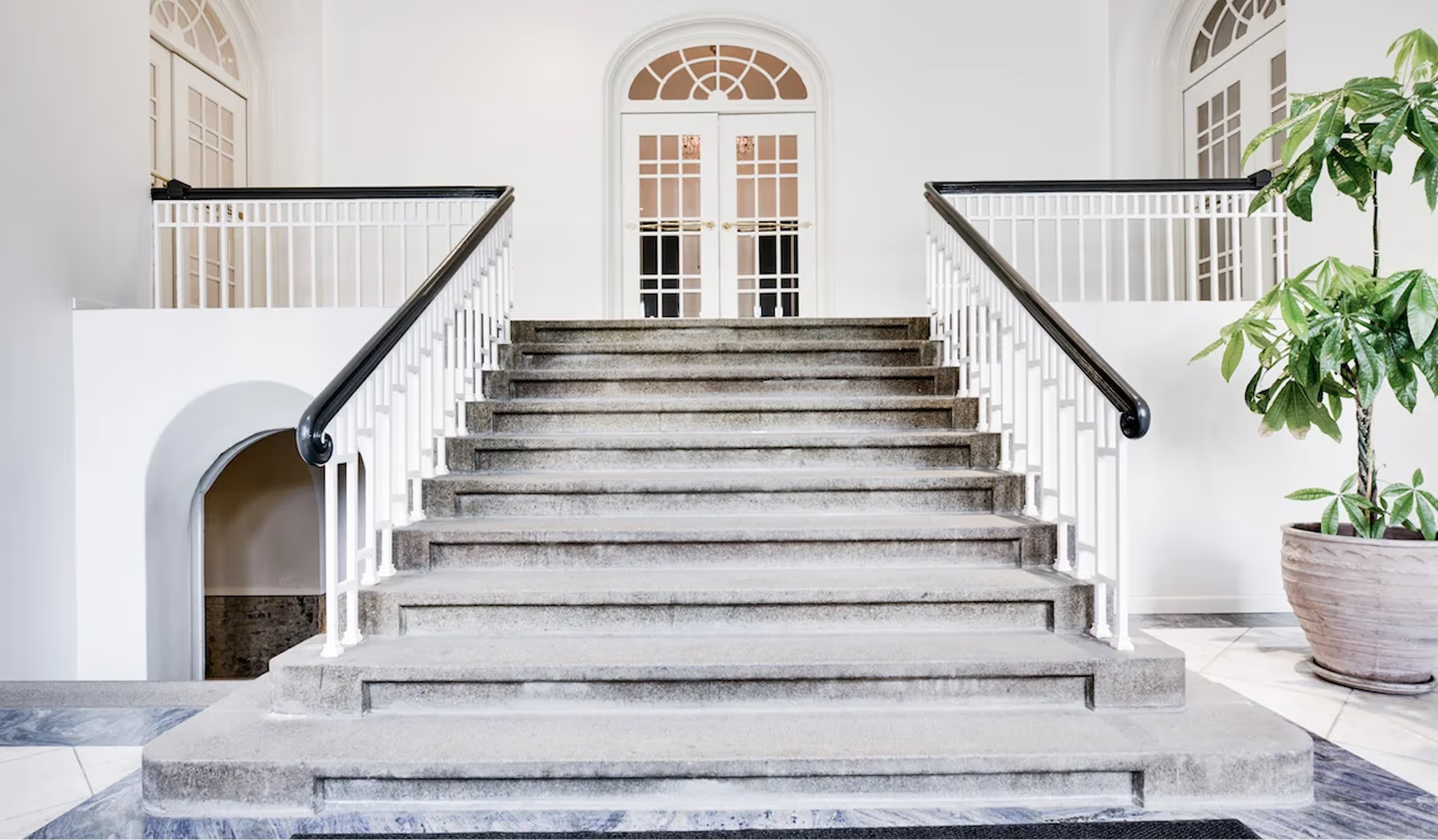
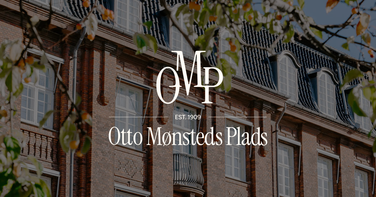
The building is more than a residence. It carries the feeling of a modern palace in the city, rooted in Scandinavian design traditions and a strong sense of belonging.
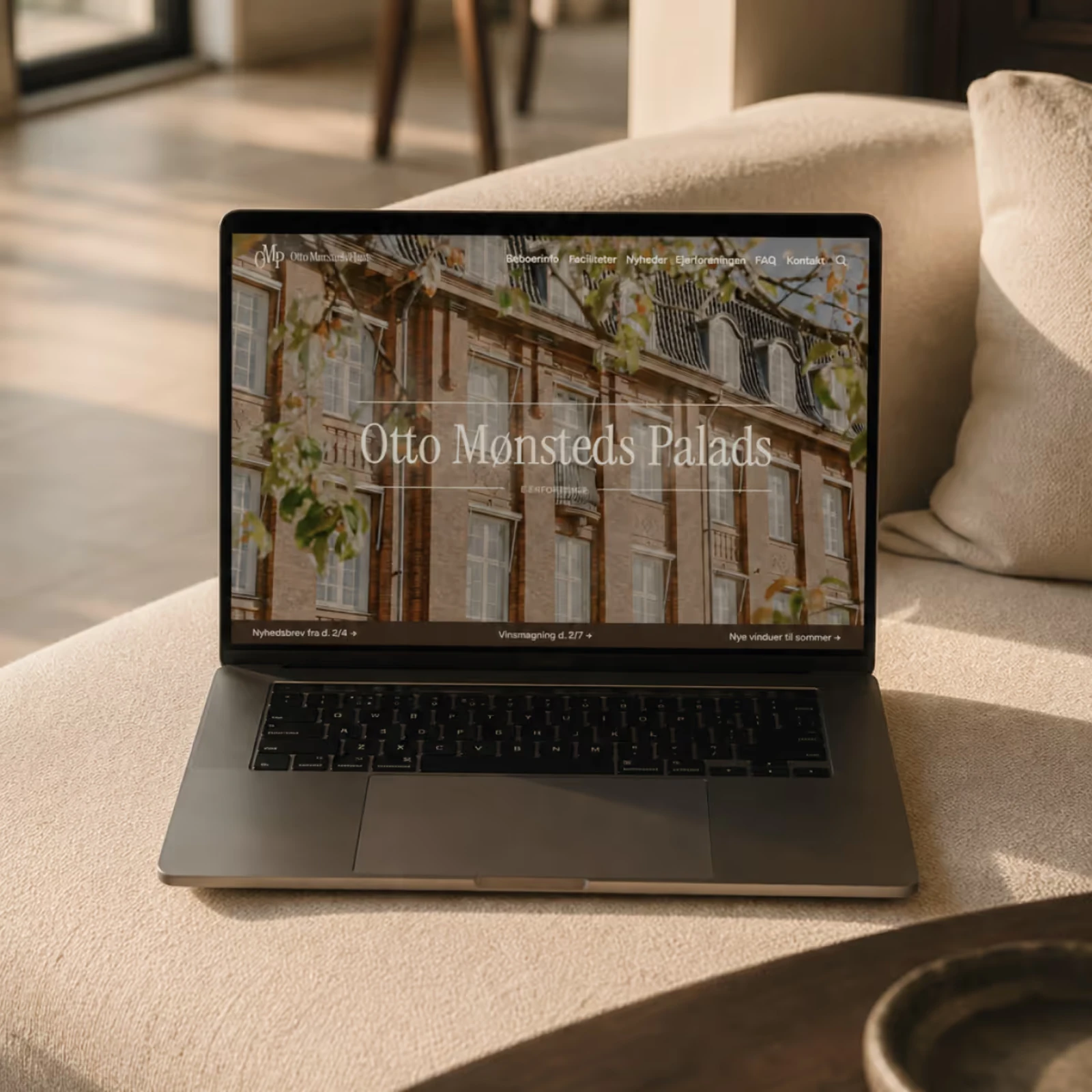
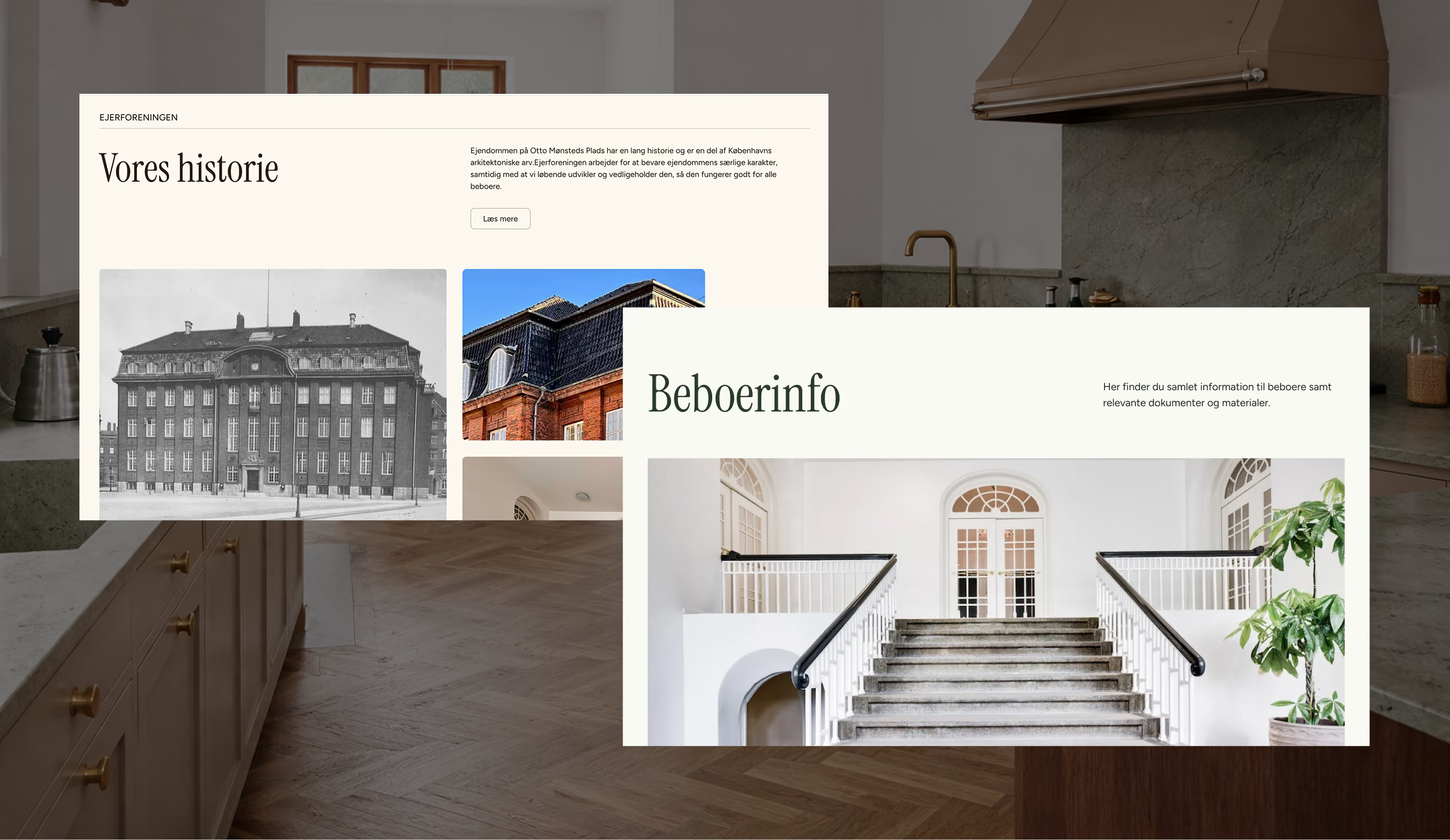
Kvalifik designed and developed a new Webflow website that brings everything together into one calm and intuitive experience. The goal was to create a digital platform that feels premium, easy to use, and true to the identity of the building.

- Rebecca Busk
- Francesca Tiziani
- Klara Brinck Hecter
- Ida Elisabeth Jensen
The existing digital experience no longer reflected the quality and character of the property. The new direction created a more timeless, premium, and cohesive identity inspired by the architecture and atmosphere of the building itself.
The vision was to create a calm and elegant digital experience rooted in Scandinavian design traditions. The website was designed to feel understated, refined, and natural rather than overly commercial.
Kvalifik focused on creating a visual identity that respected the history of the property while modernizing the overall experience. This included typography, spacing, color direction, layouts, and a more cohesive digital presence.
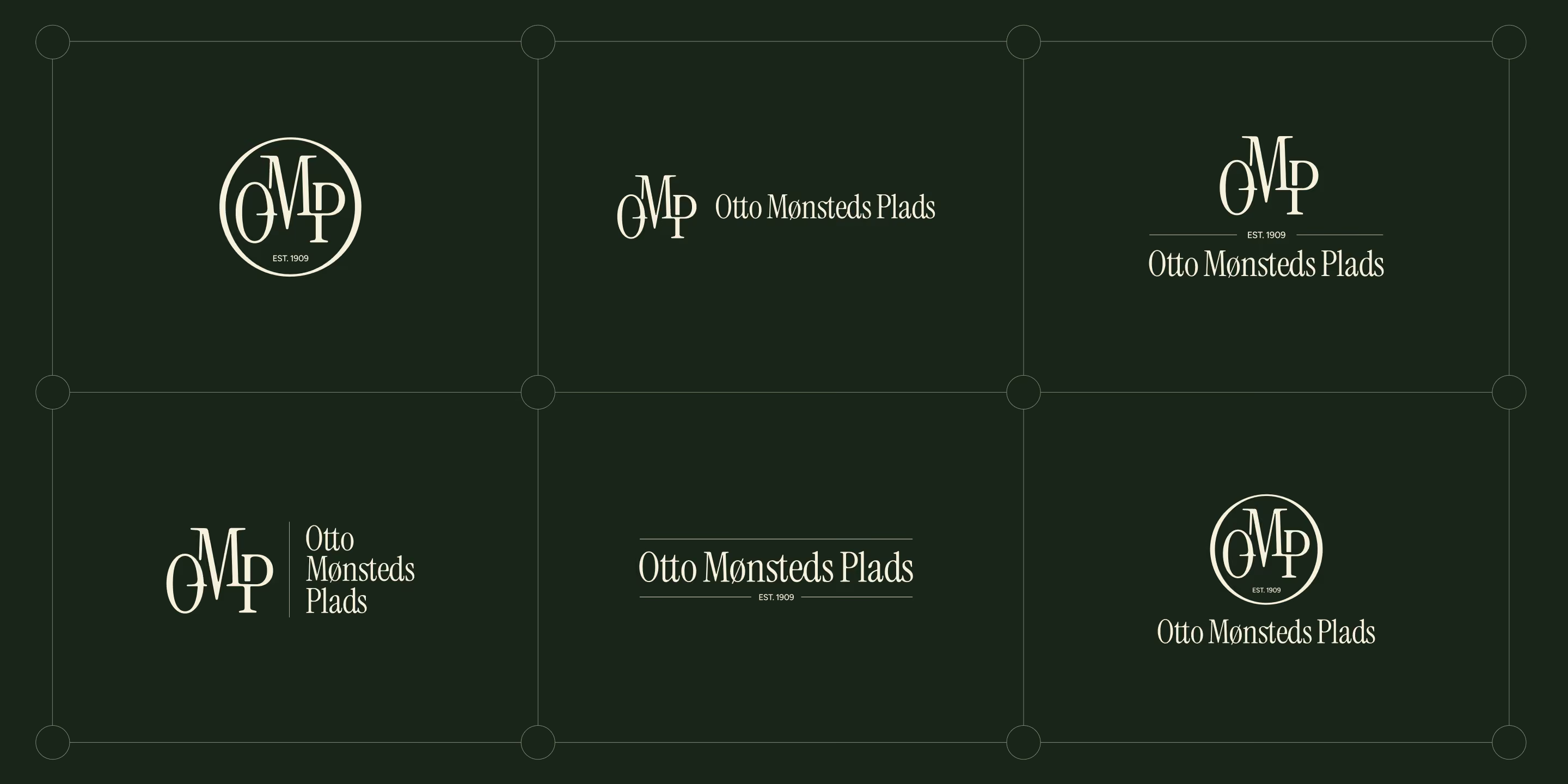
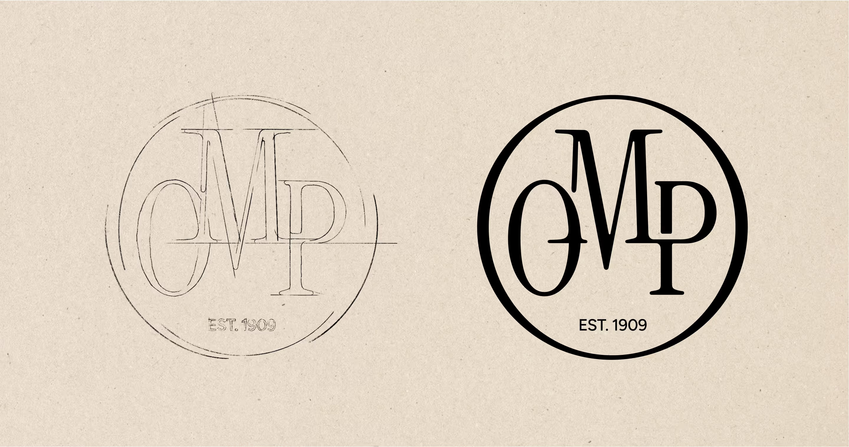
The logo work focused on refinement rather than reinvention. The goal was to create a cleaner and more timeless expression that fits naturally with the updated visual identity and digital experience.
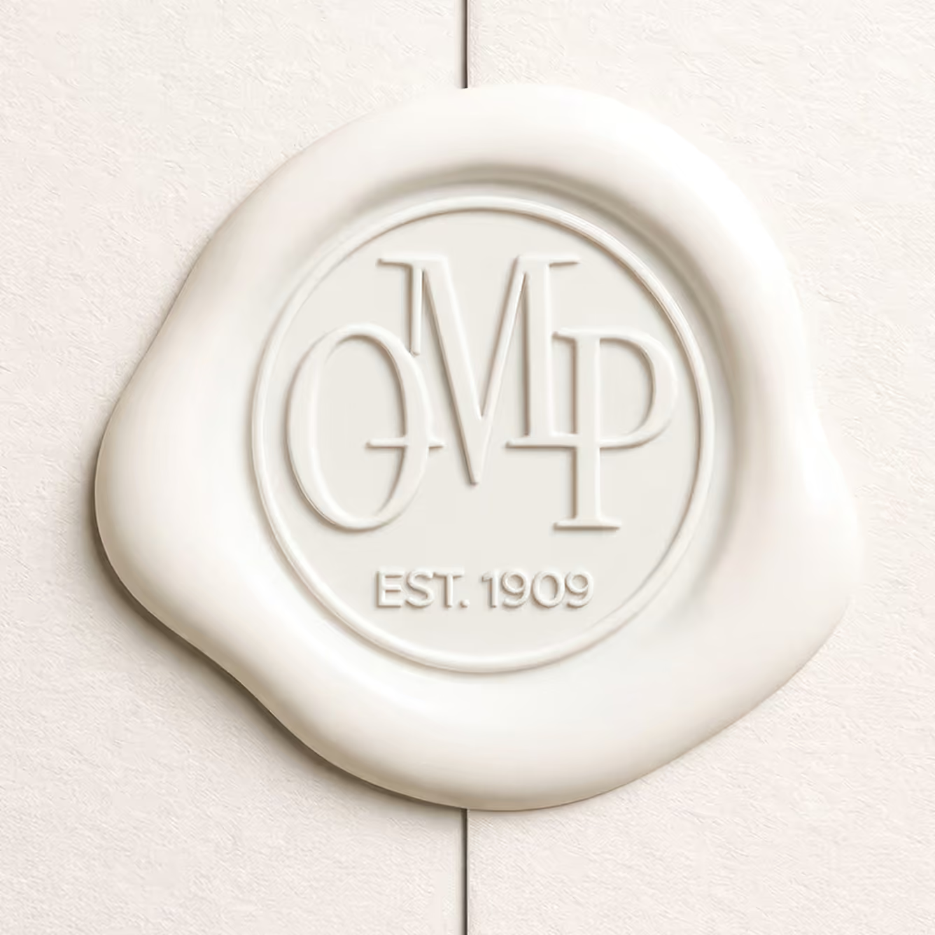
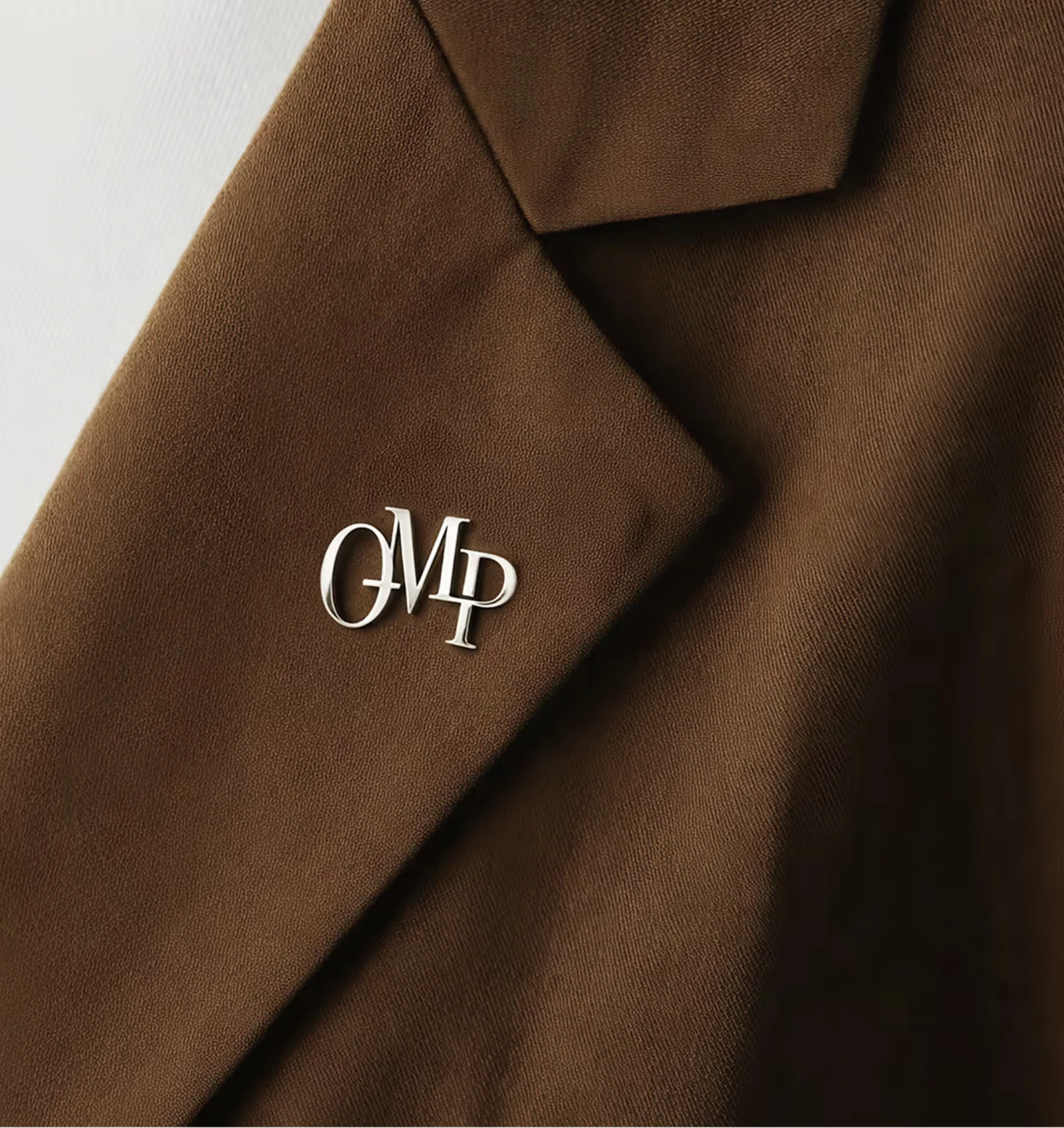
The logo distills the essence of Otto Mønsteds Plads into a refined and timeless mark. A carefully constructed monogram reflects the building's heritage while expressing quiet elegance and permanence. It works as the central symbol of the identity, connecting history with contemporary sophistication.
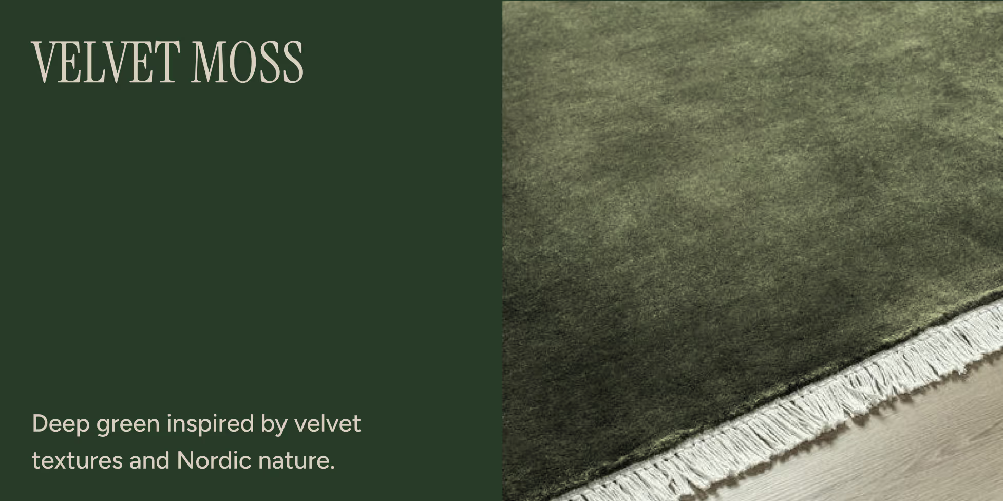
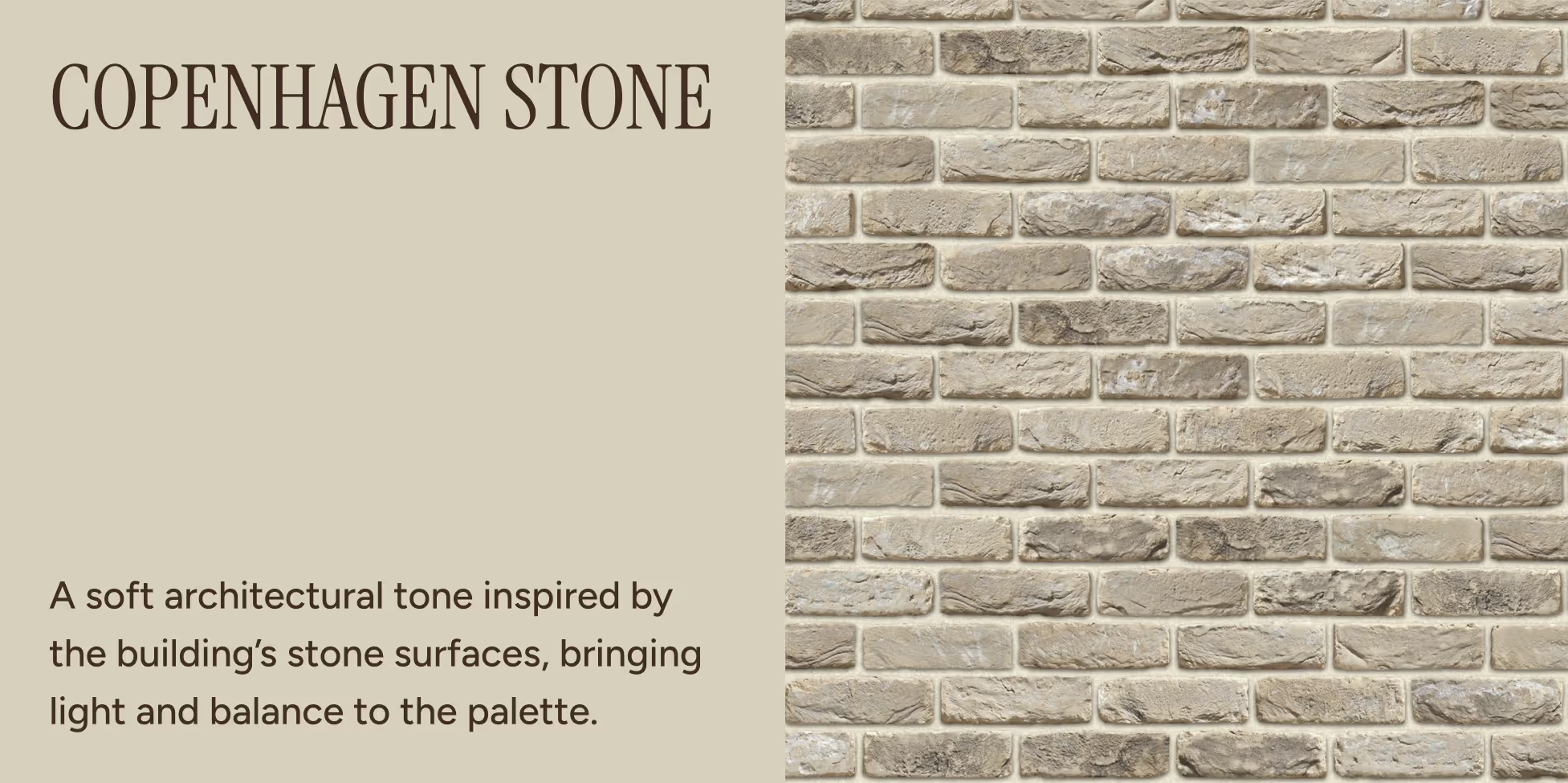
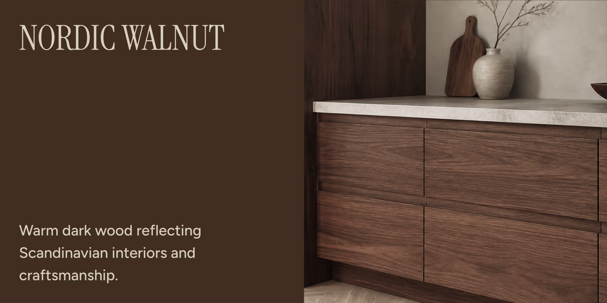
The brand identity draws from the building's architecture, history, and cultural context. A palette inspired by natural materials and heritage references creates a warm and grounded expression. Together, these elements establish a balance between historic presence and modern living.
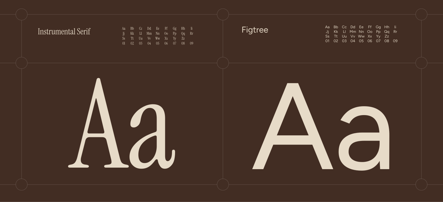
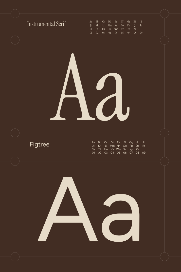
The typography reflects a dialogue between tradition and contemporary clarity. Instrumental Serif brings elegance and structure, while Figtree ensures readability and warmth. Combined, they create a refined and distinctly Scandinavian visual voice.
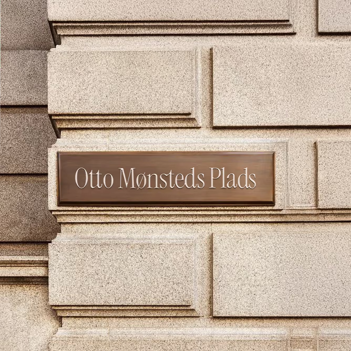
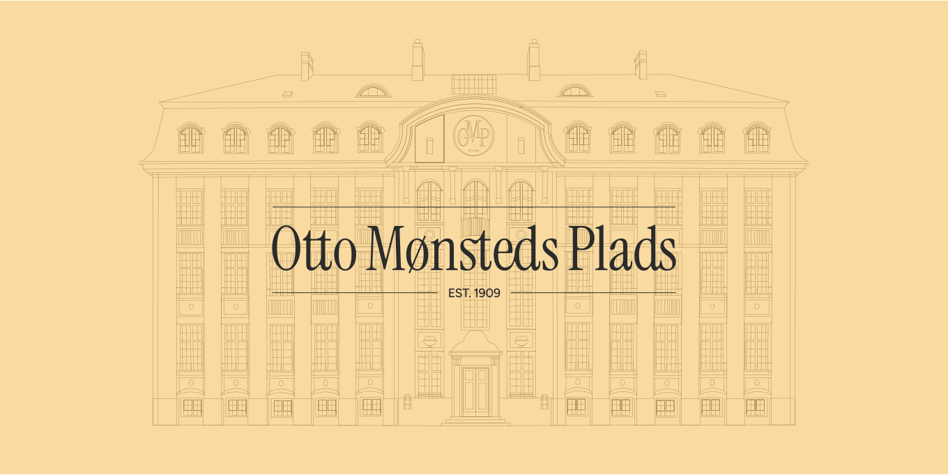
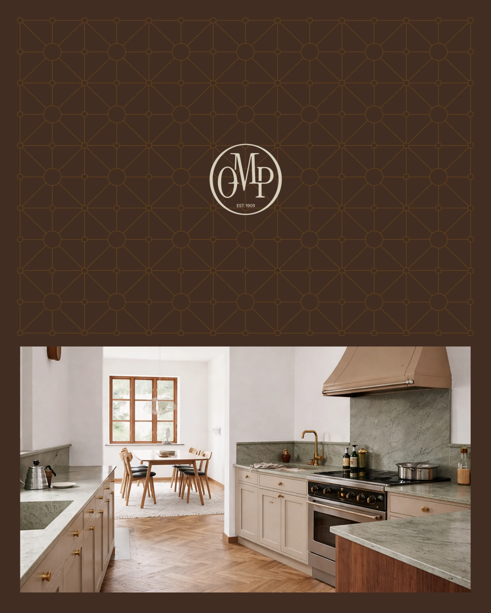
The identity extends across a series of applications that connect directly to the building's architecture. Line-based illustrations evolve into patterns and compositions, adding rhythm and visual texture. Paired with photography and the emblem, the system creates a cohesive and atmospheric brand presence.
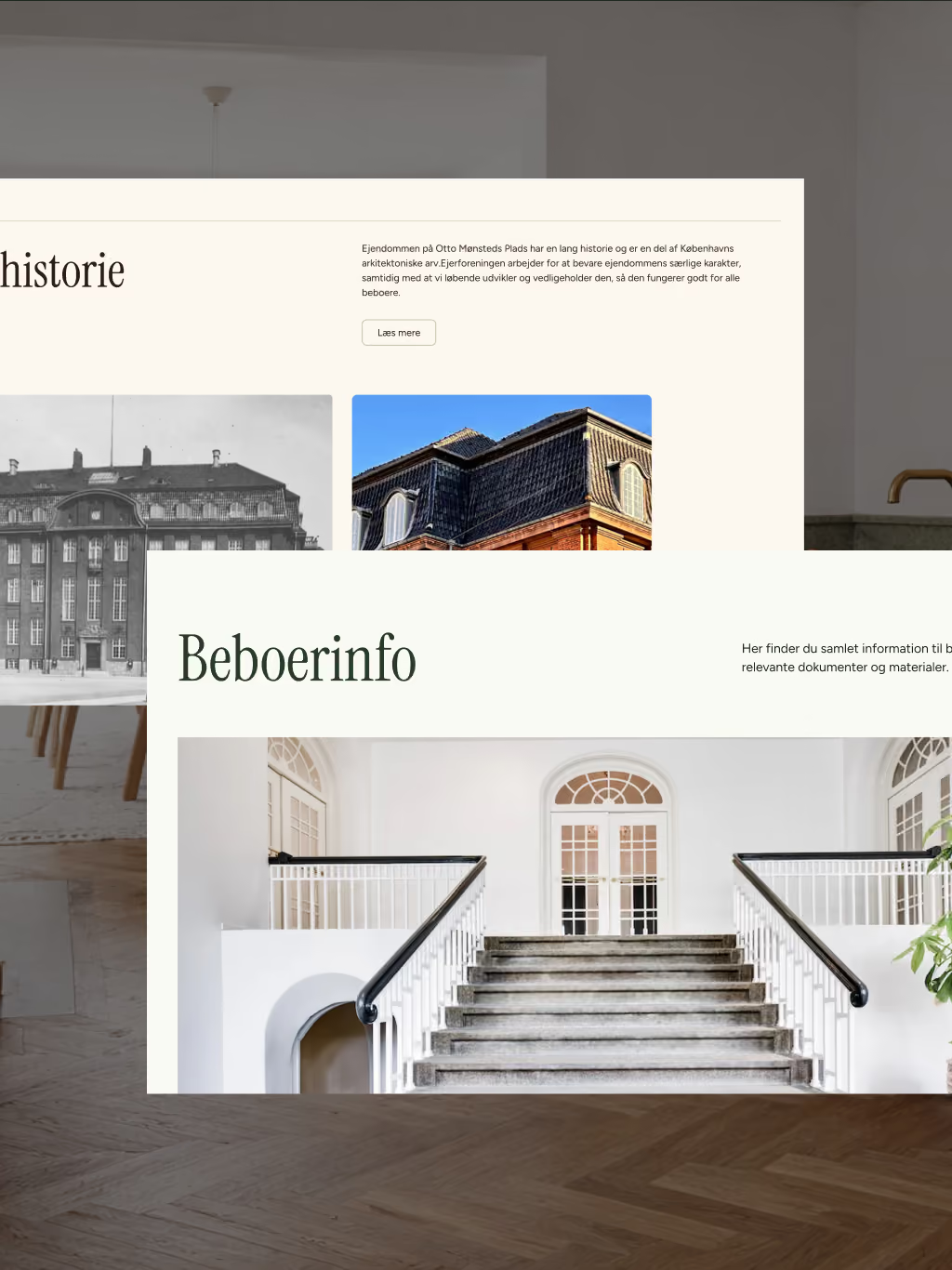
The website translates the identity into a digital experience defined by clarity and calm. Structured layouts, refined typography, and restrained use of color create a sense of space and elegance. The result is an intuitive platform that reflects the character of a modern city palace.
See other cases