Website redesign and visual identity for leading UX research consultancy

- Søren Højland Boesen (Former Employee)
- Ida Elisabeth Jensen
- Francesca Tiziani
Loop UX had outgrown their old one. It relied mainly on hand-drawn illustrations, which gave it character but made it hard to see who Loop UX are and how they work. For a UX research company built on understanding real people, the researchers were barely visible, and the site worked more like an online business card than a platform for growth.
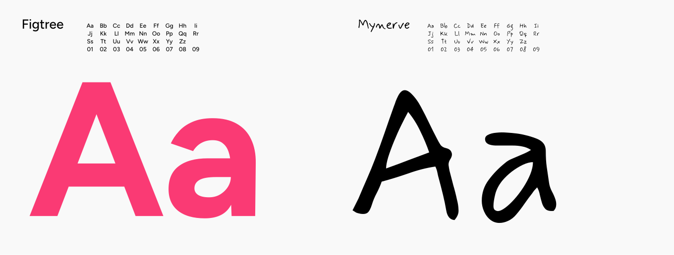
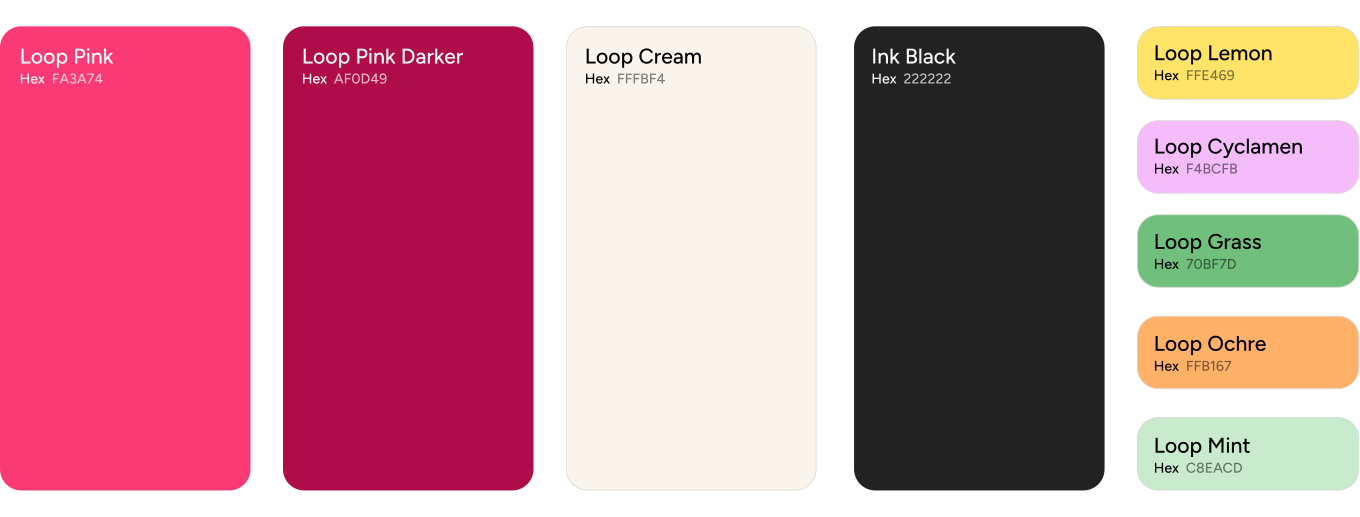
Kvalifik delivered a refined logo, a refreshed visual identity and a new Webflow website for Loop UX. The swirl in the logo reflects conversation and iteration, and shows how Loop UX ties insights, users and decisions together. The website is a modern, high-performing Webflow build that works as both a brand platform and a business asset, with a strong foundation for future content and growth.
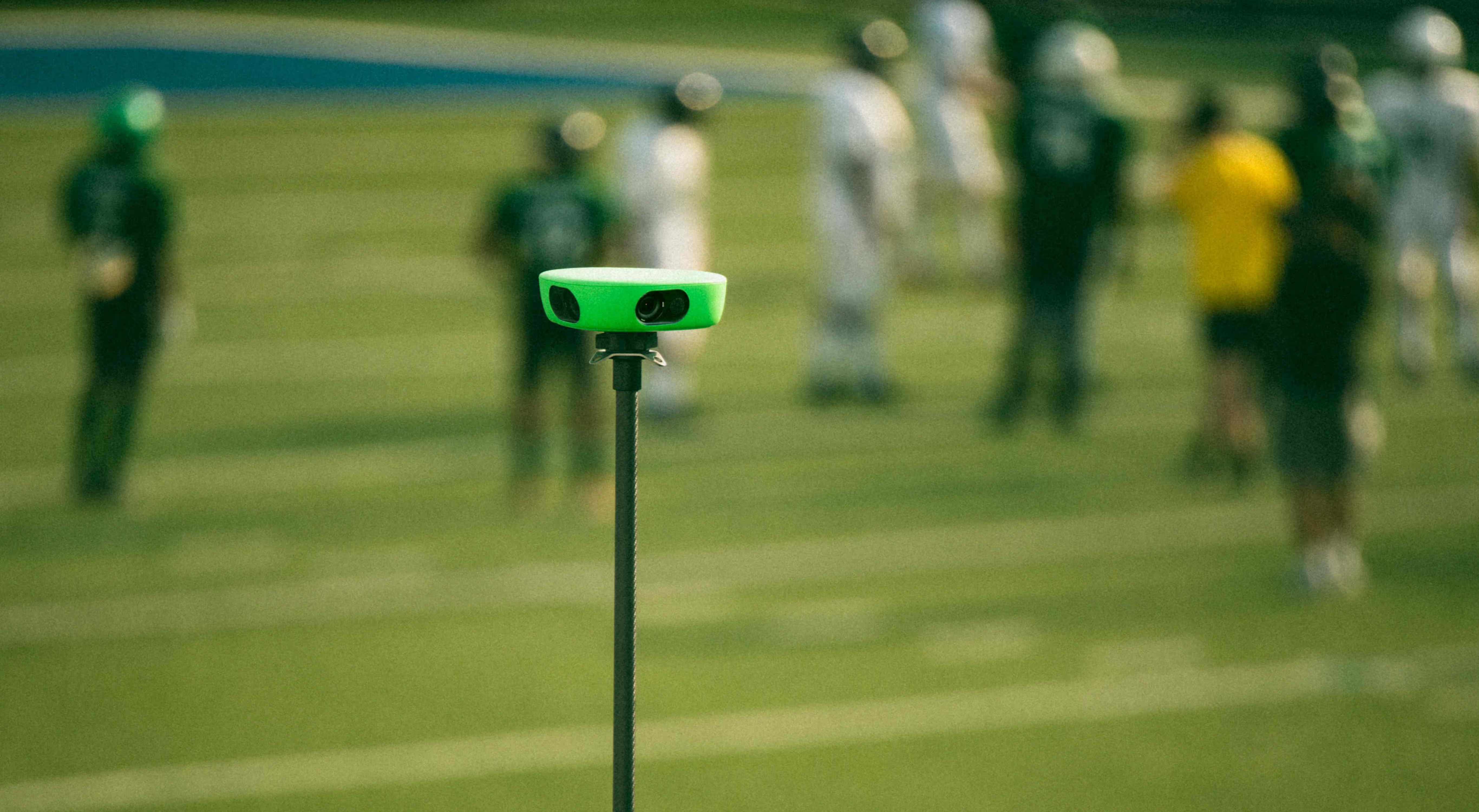
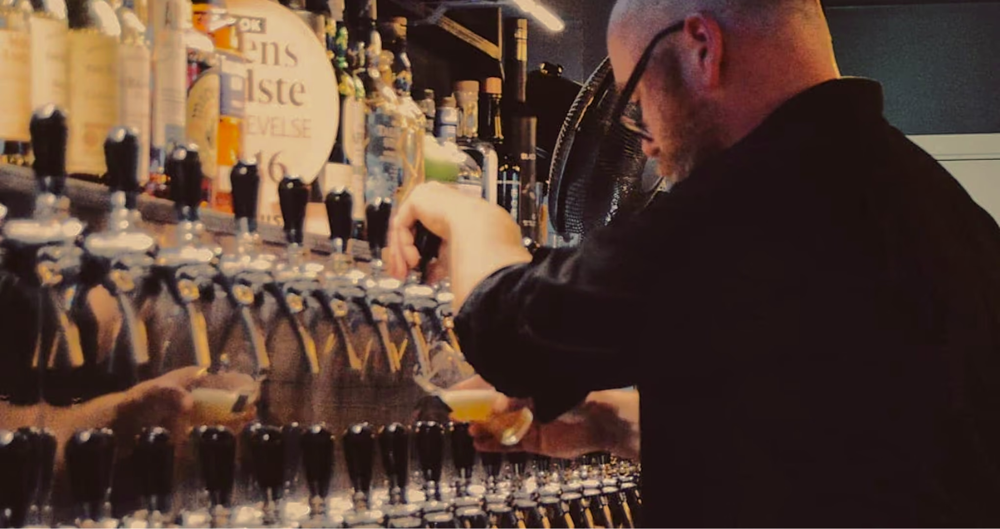
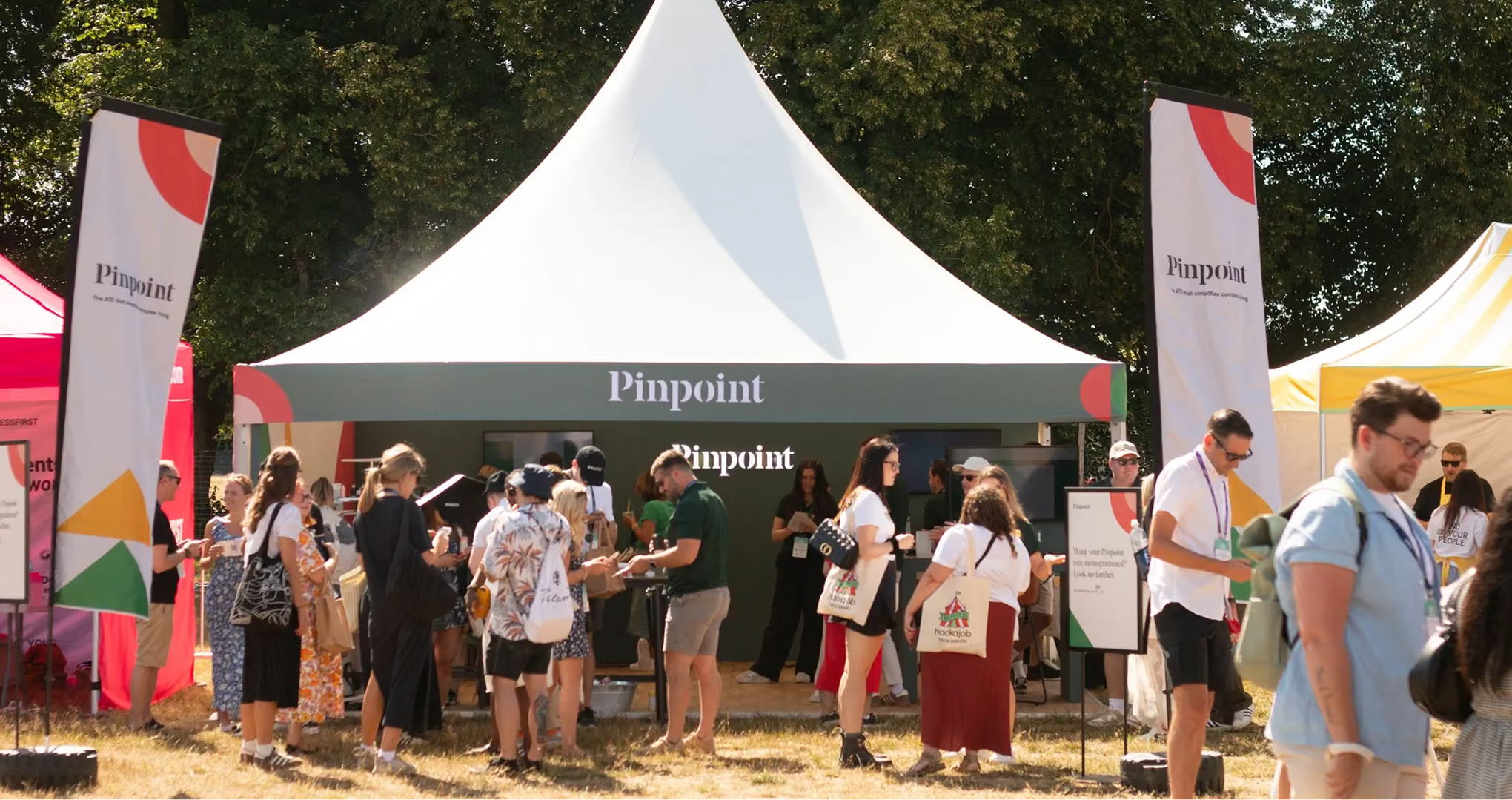
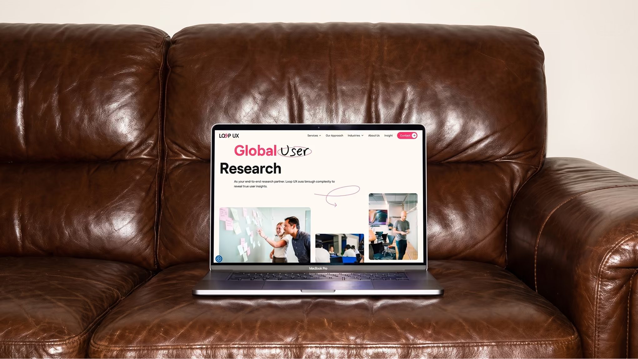
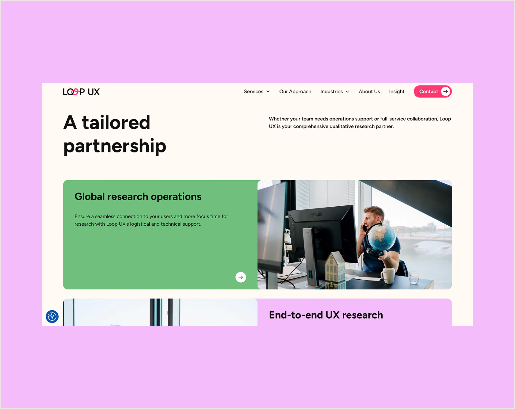
You put them front and center. The new Loop UX website uses real imagery and clear storytelling to show what Loop UX does and how the researchers work, where the old site relied on hand-drawn illustrations. For a company that sells human-centered research, showing the humans is the point.
Loop UX got what they were promised, at the agreed price and quality. “We are truly happy with the result,” says Line Færch Christensen, CEO of Loop UX. She also points to the process, which gave the Loop UX team space for the internal conversations that helped them land on something that feels exactly right for them.

Loop UX had outgrown their existing website. The visual expression relied mainly on hand-drawn illustrations, which gave the site character but made it difficult to understand who Loop UX are and how they work. For a company built on understanding real people, the human presence was largely missing. The researchers, their process, and their interaction with clients were not clearly visible.
At the same time, the site functioned more as an online business card than a strategic platform. It did not fully communicate the breadth of services, the insight-driven approach, or the calibre of clients. The challenge was to create a website that felt credible, contemporary, and human, while supporting growth and visibility.
Logo design
A fresh logo with a swirl
Website design
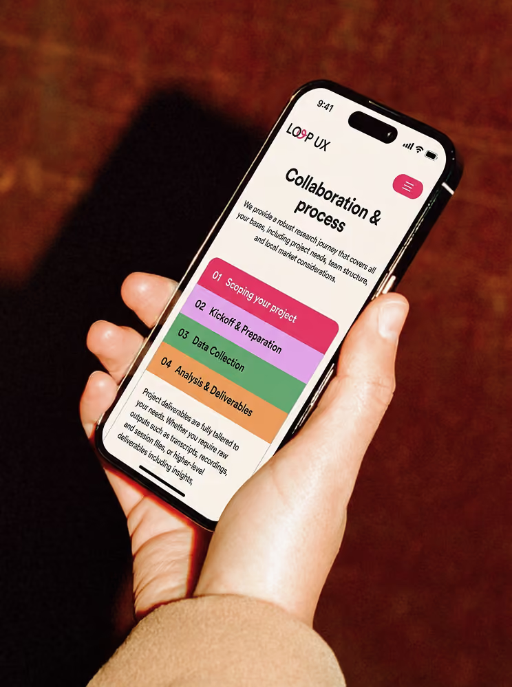
A vibrant new online presence with humans front and center
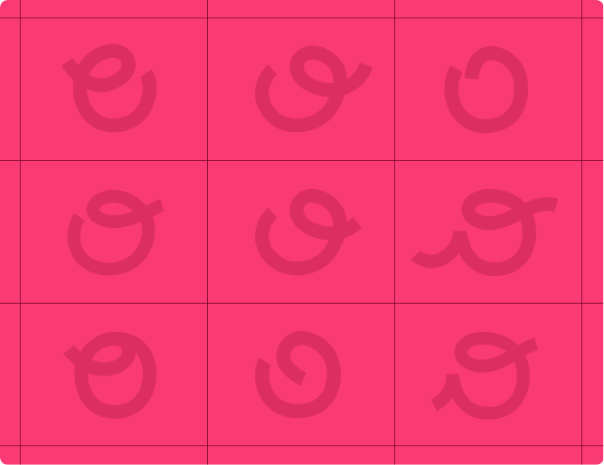
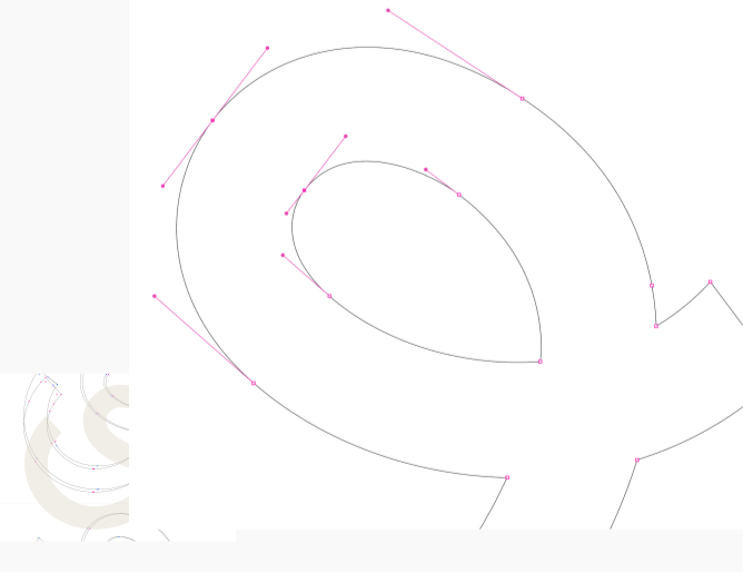
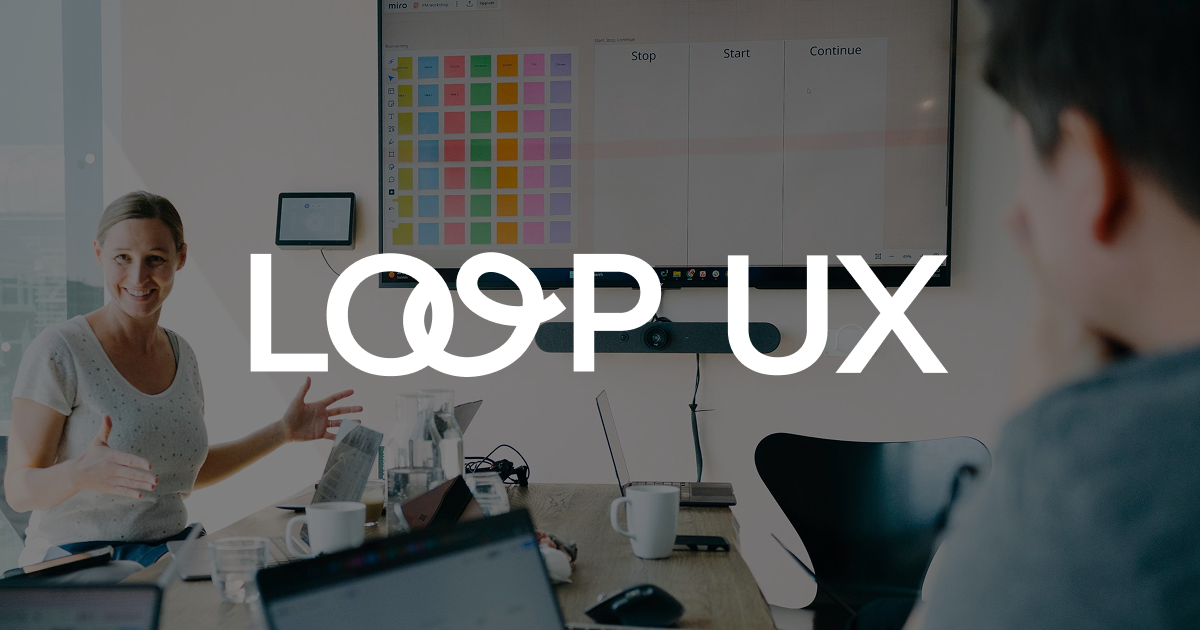
Kvalifik refined the Loop UX logo as part of the project. Central to the identity is the swirl element, which adds a human quality and reflects conversation, movement, and iteration. It also communicates how Loop UX ties insights, users, and decisions together, reinforcing the idea of loops as a connective force. The logo was designed to work across digital touchpoints and in close harmony with the website’s visual system.
The final website is a modern, high-performing Webflow build that serves as both a brand platform and a business asset. It clearly communicates Loop UX’s services and approach, highlights the people behind the research, and provides a strong foundation for future content and growth.
The result is a website that feels confident without being corporate, human without being informal, and precise without being rigid. It reflects where Loop UX is today and supports where they are heading next.
See other cases