A brand identity that transforms complexity into clarity

client quote
- Rebecca Busk
- Francesca Tiziani
- Patrick Aurbo
- Riziki Nielsen
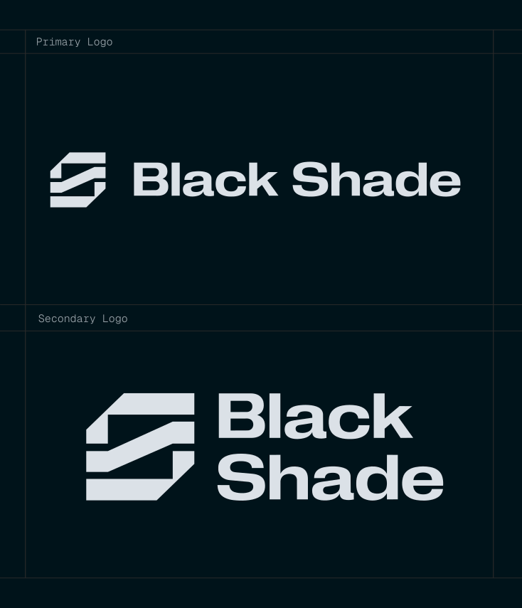
Kvalifik created a logo and a brand identity for Black Shade, a company working in a complex maritime context where information is fragmented and hard to act on. The result is a modular brand system with a sharp logo, a clear visual language and a digital-first identity designed for modern platforms and operational environments.
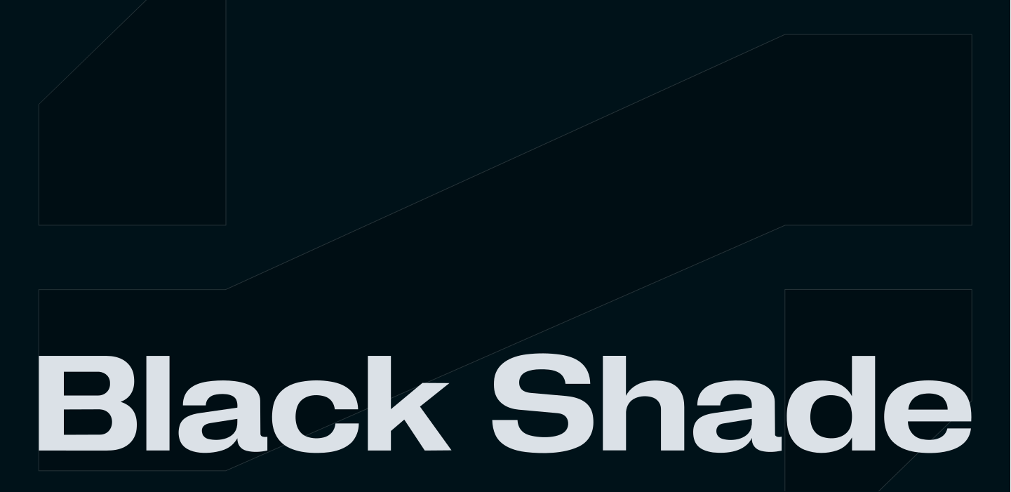
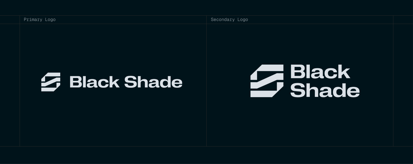
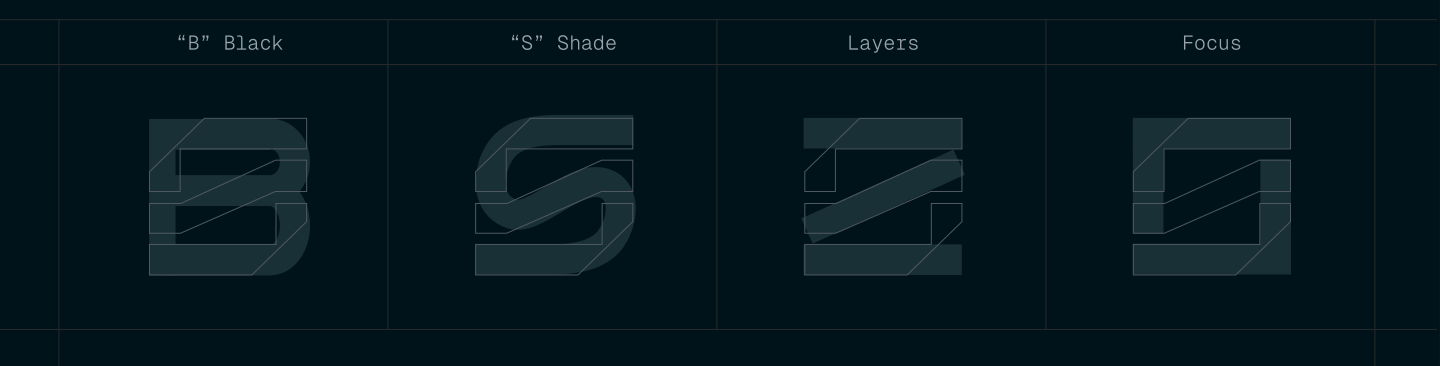
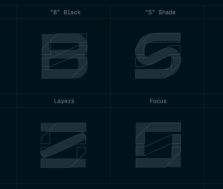
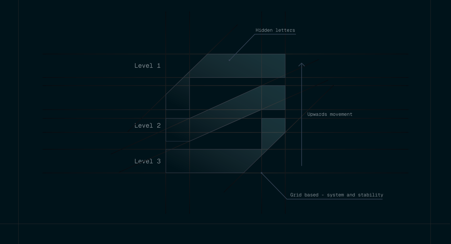
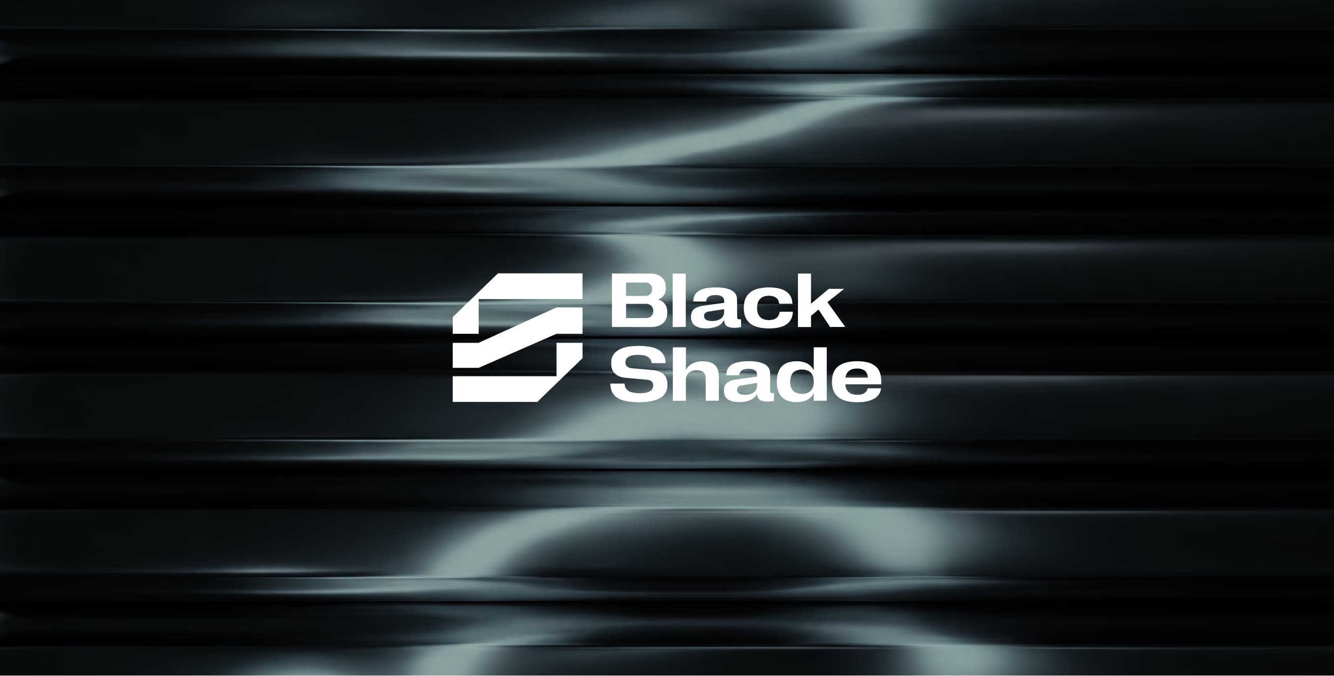
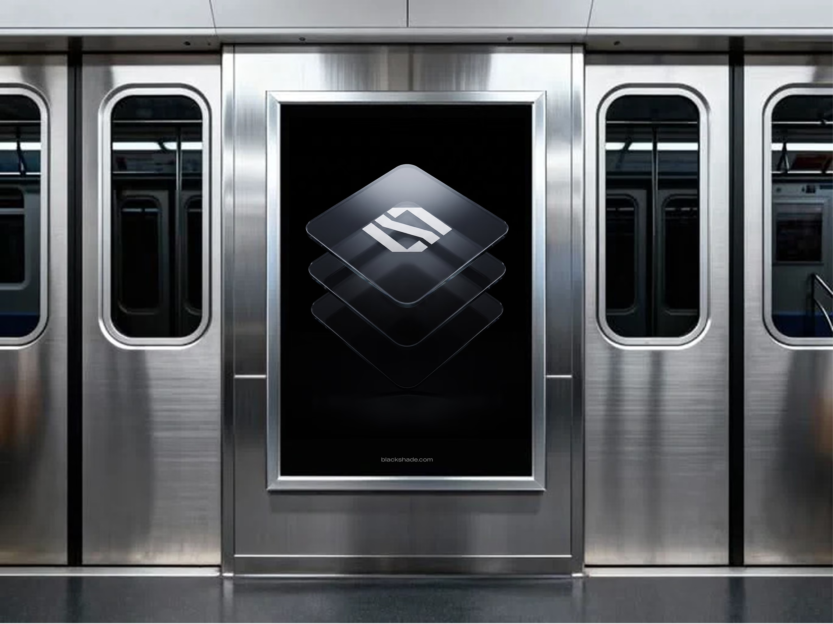
The upward movement in the Black Shade logo stands for emerging from uncertainty, or “coming out of the shade.” Its layers represent stages of filtering and refinement, mirroring how Black Shade's technology turns complex information into clarity. Subtle hidden letterforms make the mark recognizable, while softer geometric curves in the typography keep the brand approachable.
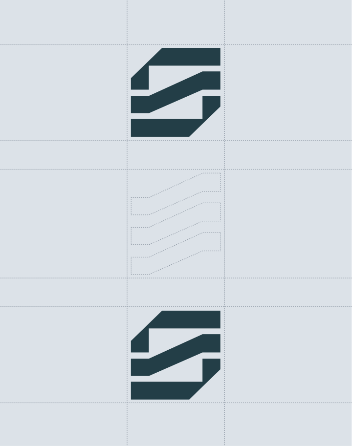
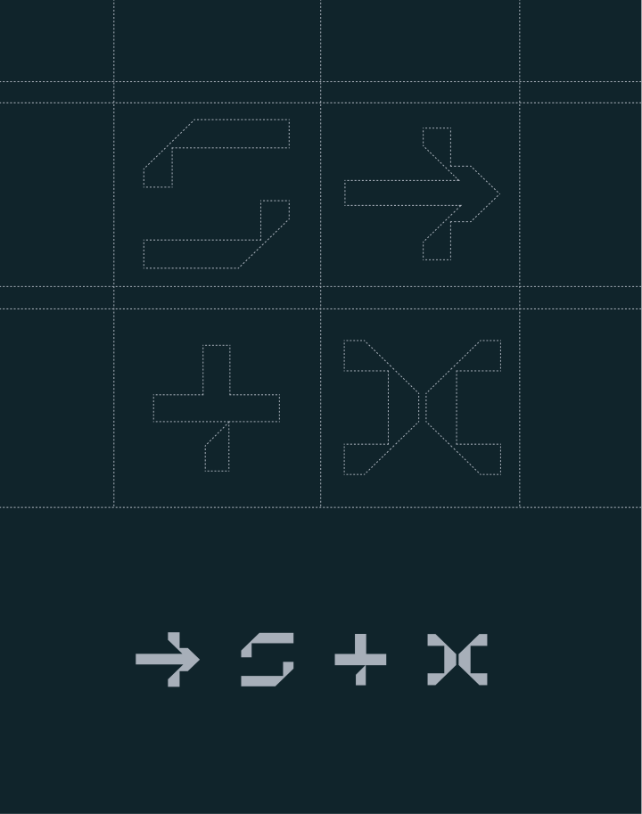
So the Black Shade brand stays consistent and scalable wherever it appears. The logo is built on a precise modular grid, and elements from it are reused across layouts, patterns, icons and digital applications. Its compact geometric structure keeps everything legible on digital platforms and operational interfaces, the environments the identity was designed for.
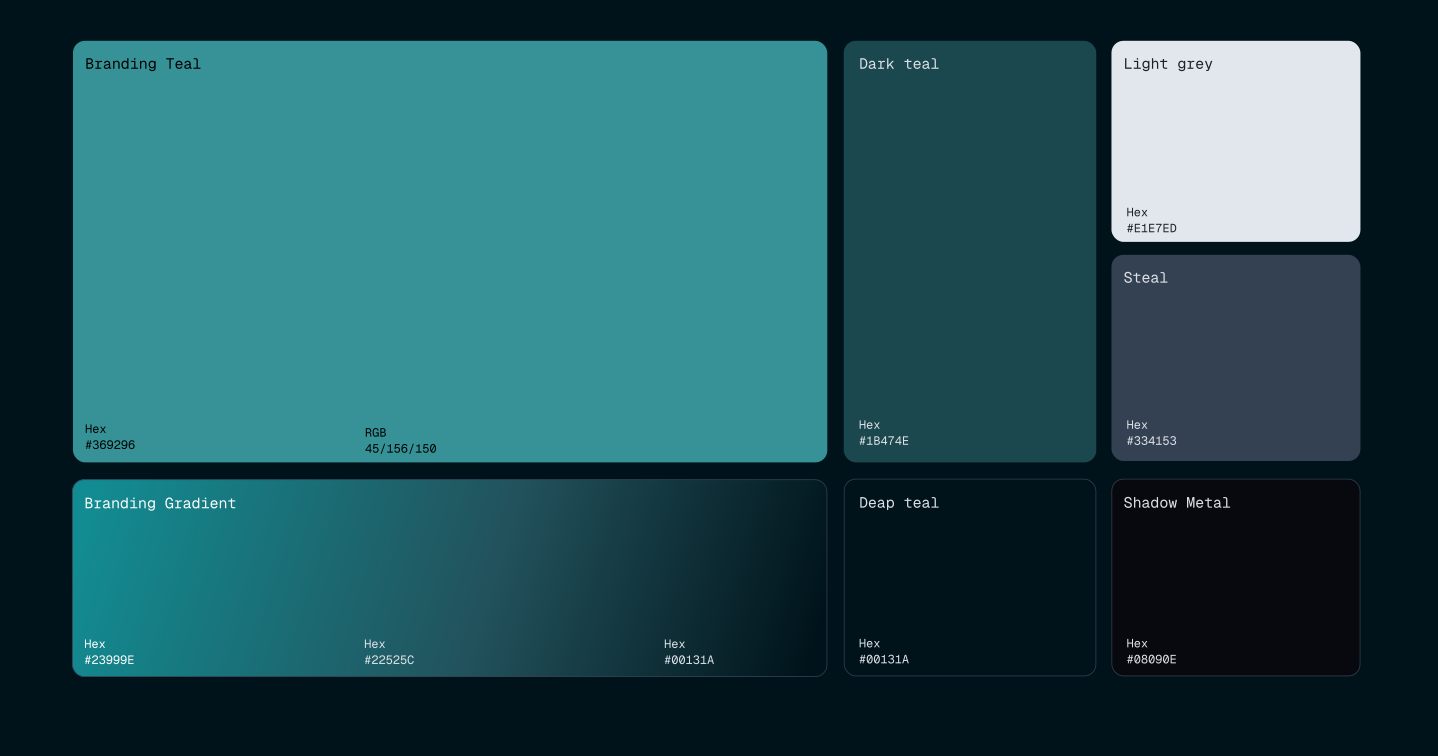
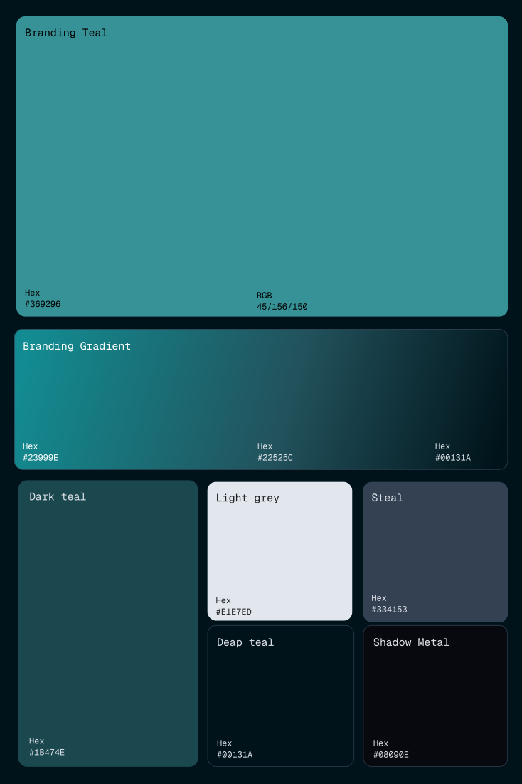
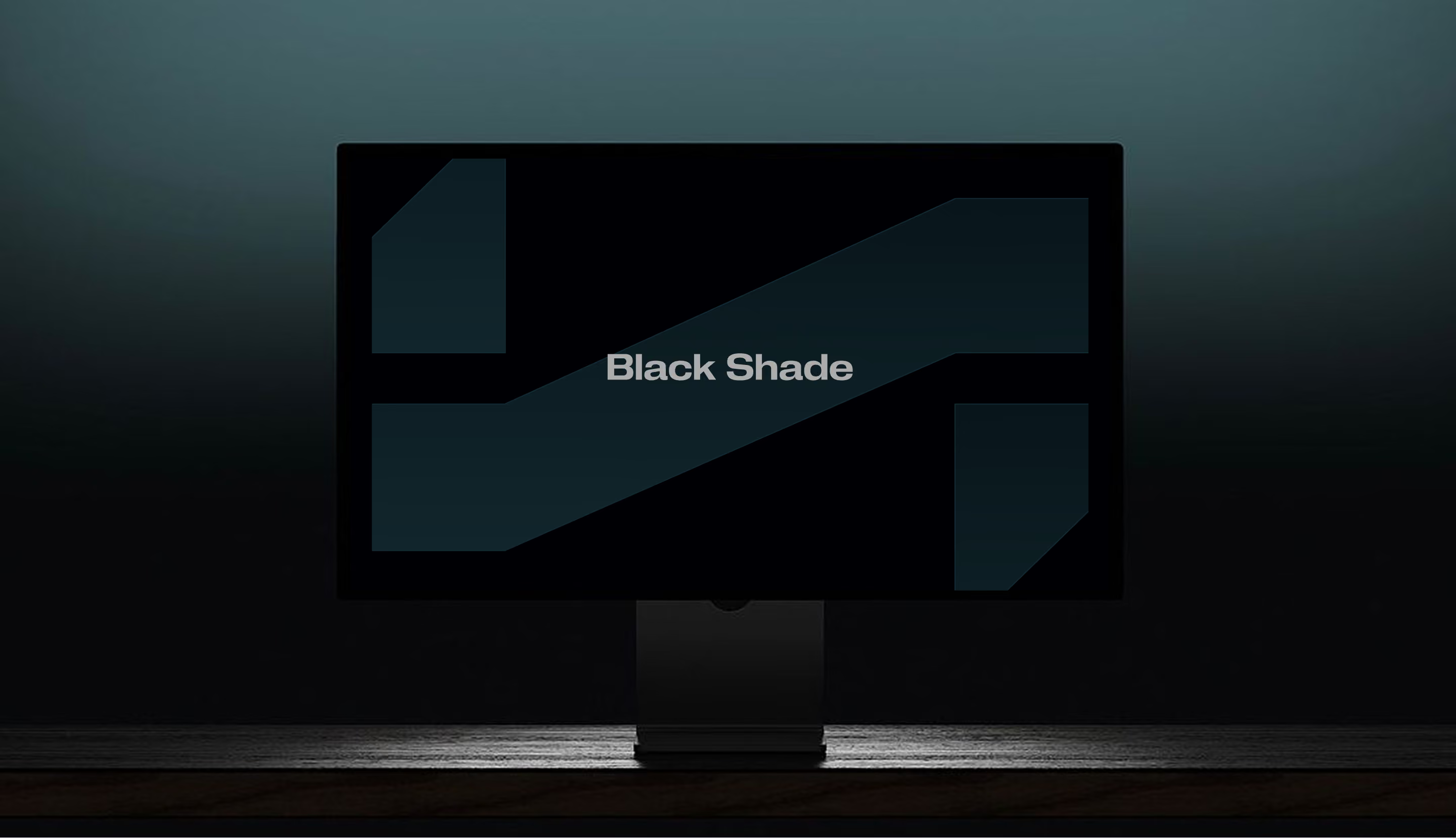
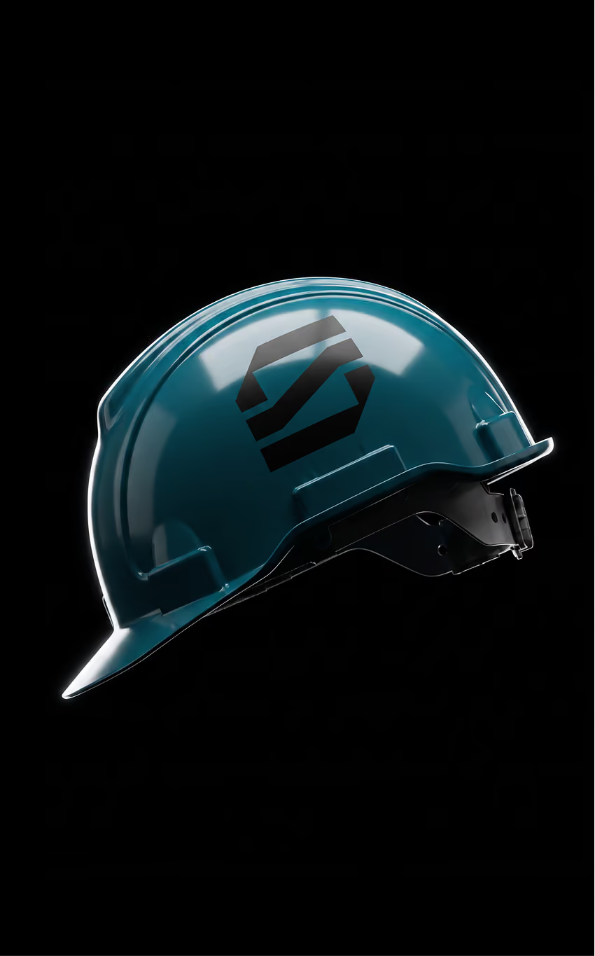
Black Shade's teal palette, fading through darker shades into black, expresses intelligence, depth and confidence. The company works in a maritime field where decisions depend on understanding what is happening fast, so the brand has to project trust and control. Paired with minimal layouts and precise typography, the colors give Black Shade a calm but powerful presence.

Logo Design
A sharp and structured symbol that shows how complexity can be filtered into clarity. The layered mark creates a strong, recognizable identity with a sense of precision and movement.
Visual Identity
A modular visual system built around clarity, confidence and control. The identity uses structure, layering and a focused color palette to create a calm but powerful brand presence.
The Black Shade logo represents the process of filtering complexity into precision. Its layered structure reflects how information is organized, refined, and turned into clarity. The upward movement within the mark symbolizes emerging from uncertainty, directly connecting to the idea of “coming out of the shade.” Sharp geometric forms communicate strength, stability, and technical precision, while subtle hidden letterforms create a unique and recognizable identity. The typography balances this structure with softer geometric curves, adding a more human and approachable feel.
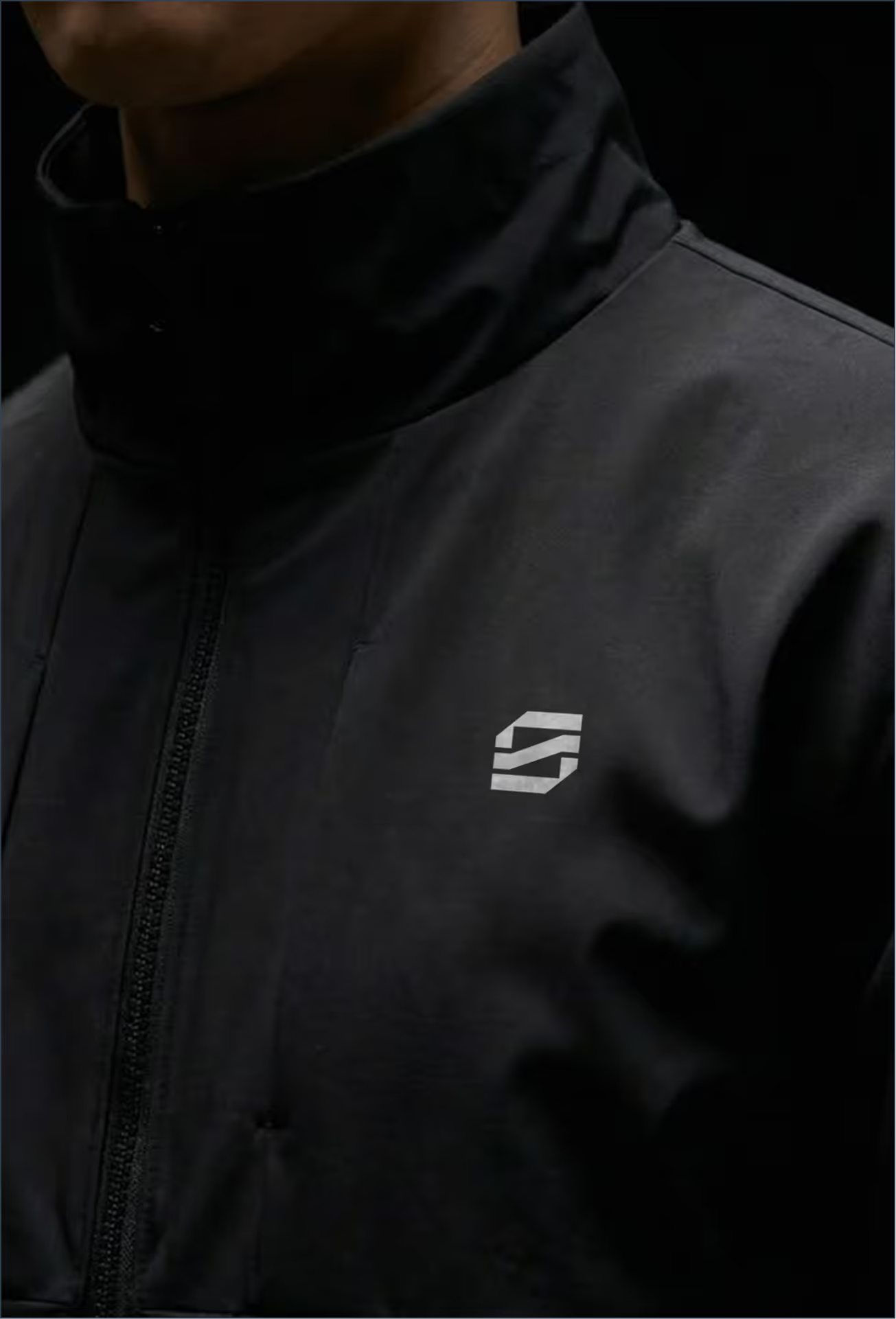
The branding system expands the logo into a clean and structured visual language based on layering, reduction, and clarity. Graphic elements and icons are derived directly from the symbol, reinforcing consistency across all applications.
The color palette centers around teal and its darker shades fading into black, expressing intelligence, depth, and confidence. Combined with minimal layouts and precise typography, the identity creates a calm yet powerful presence that reflects Black Shade’s ability to turn complexity into clear insight.
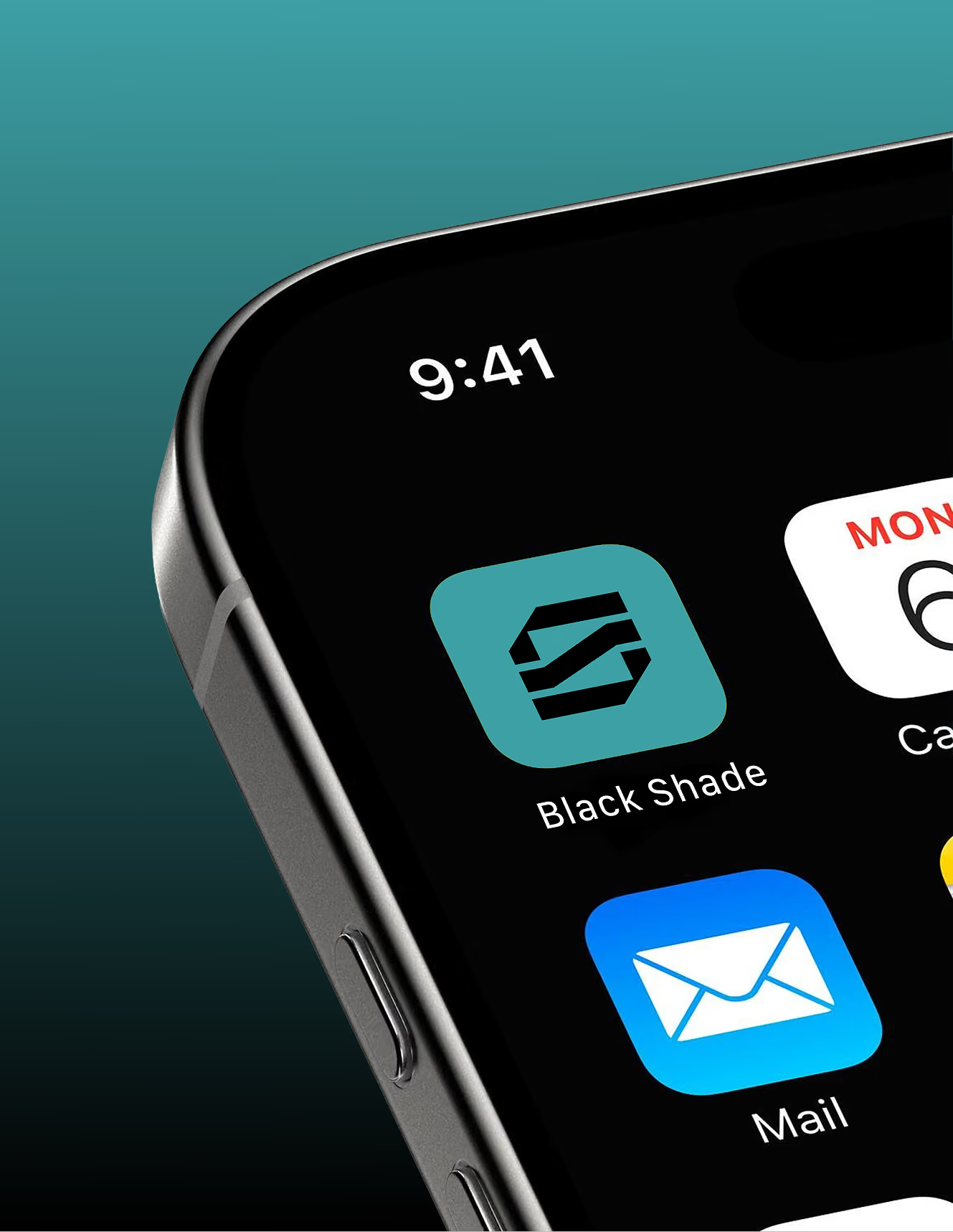
The identity is designed for digital platforms and operational interfaces, with a compact geometric structure that ensures clarity and legibility across all applications. Its modular system allows icons and visual assets to remain consistent, scalable, and instantly recognizable.

See other cases