Bringing the energy of the bar to a modern website

- Rebecca Busk
- Anja Johansen
- Ana Carolina Rijo
Taphouse needed a website that matched the bar itself. The old site had served Taphouse well over the years, but it no longer reflected the atmosphere and ambition the bar is known for. Kvalifik’s job was to create a modern digital experience that felt distinctly Taphouse. It also had to work better across devices and make it easier for guests to find their way around.
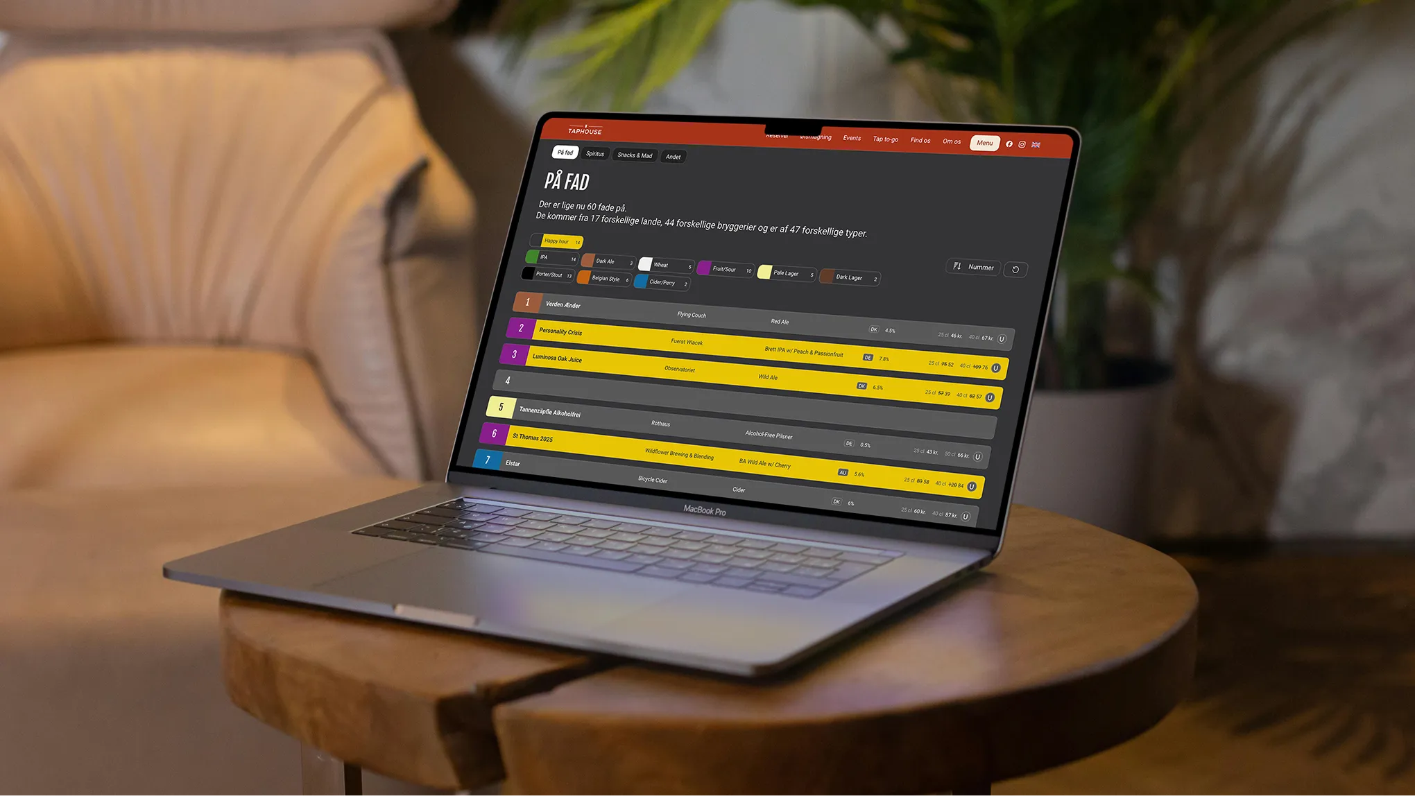
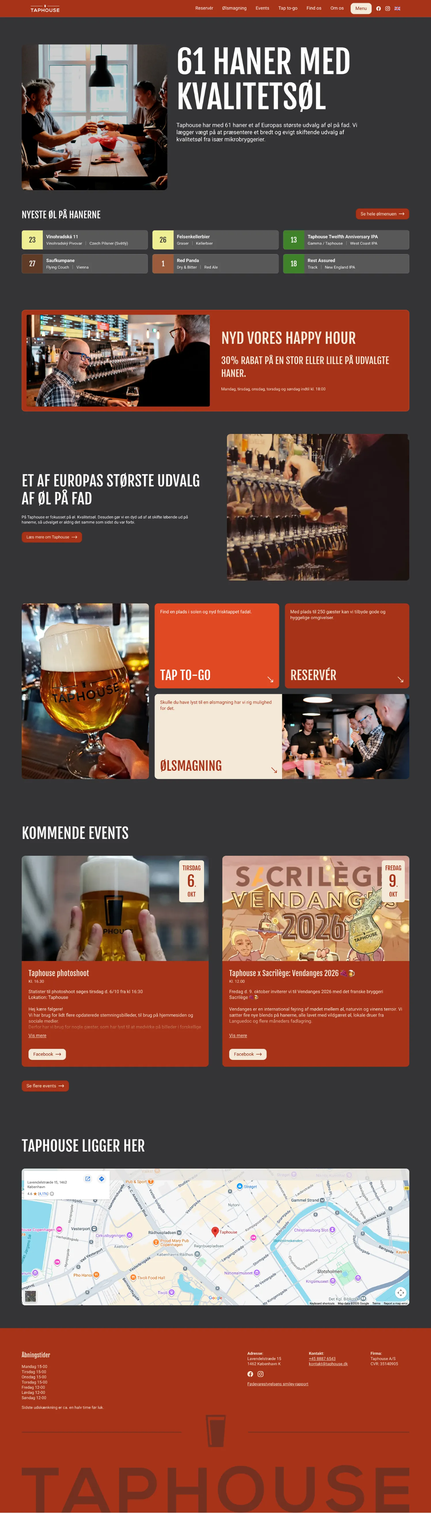
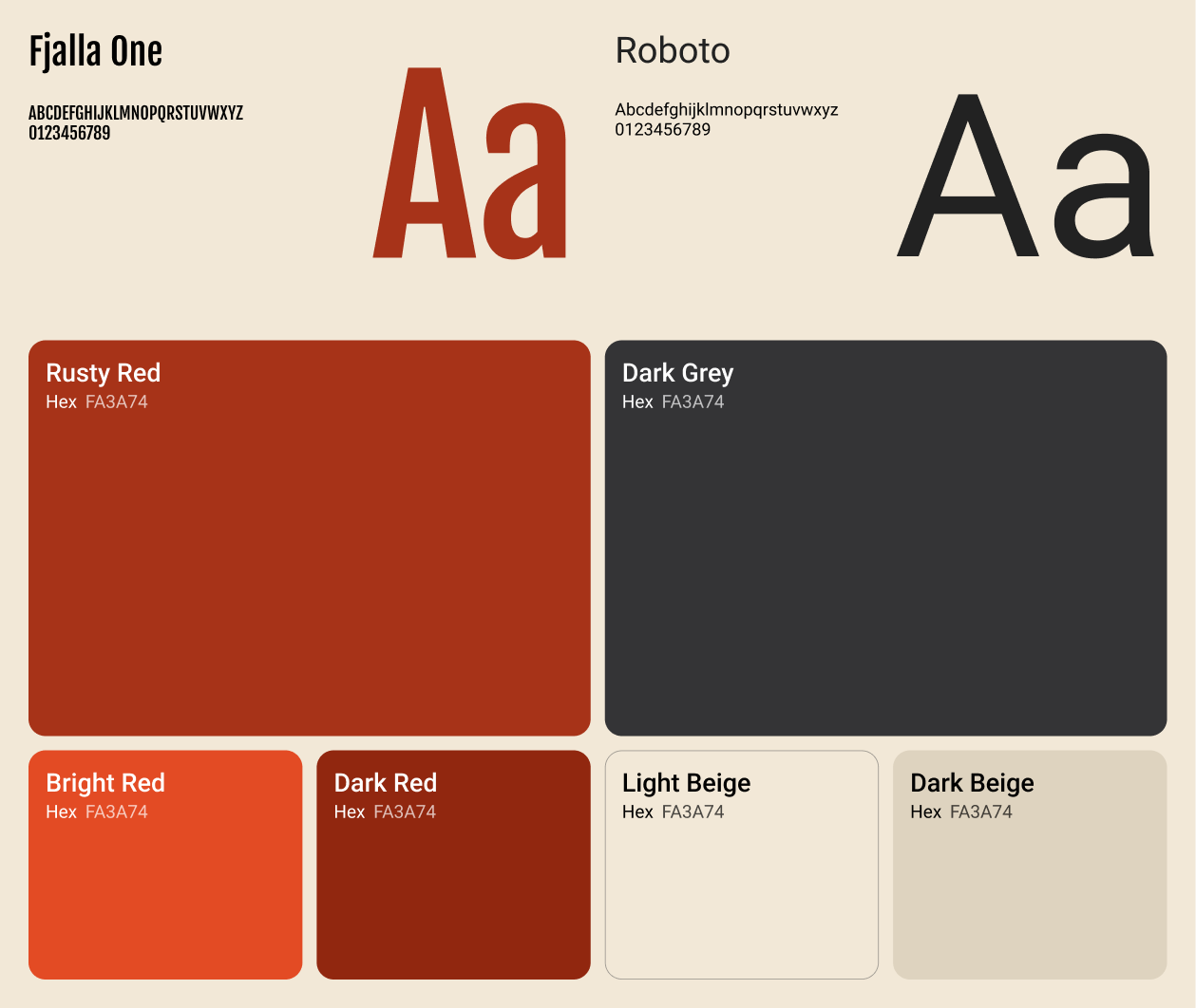
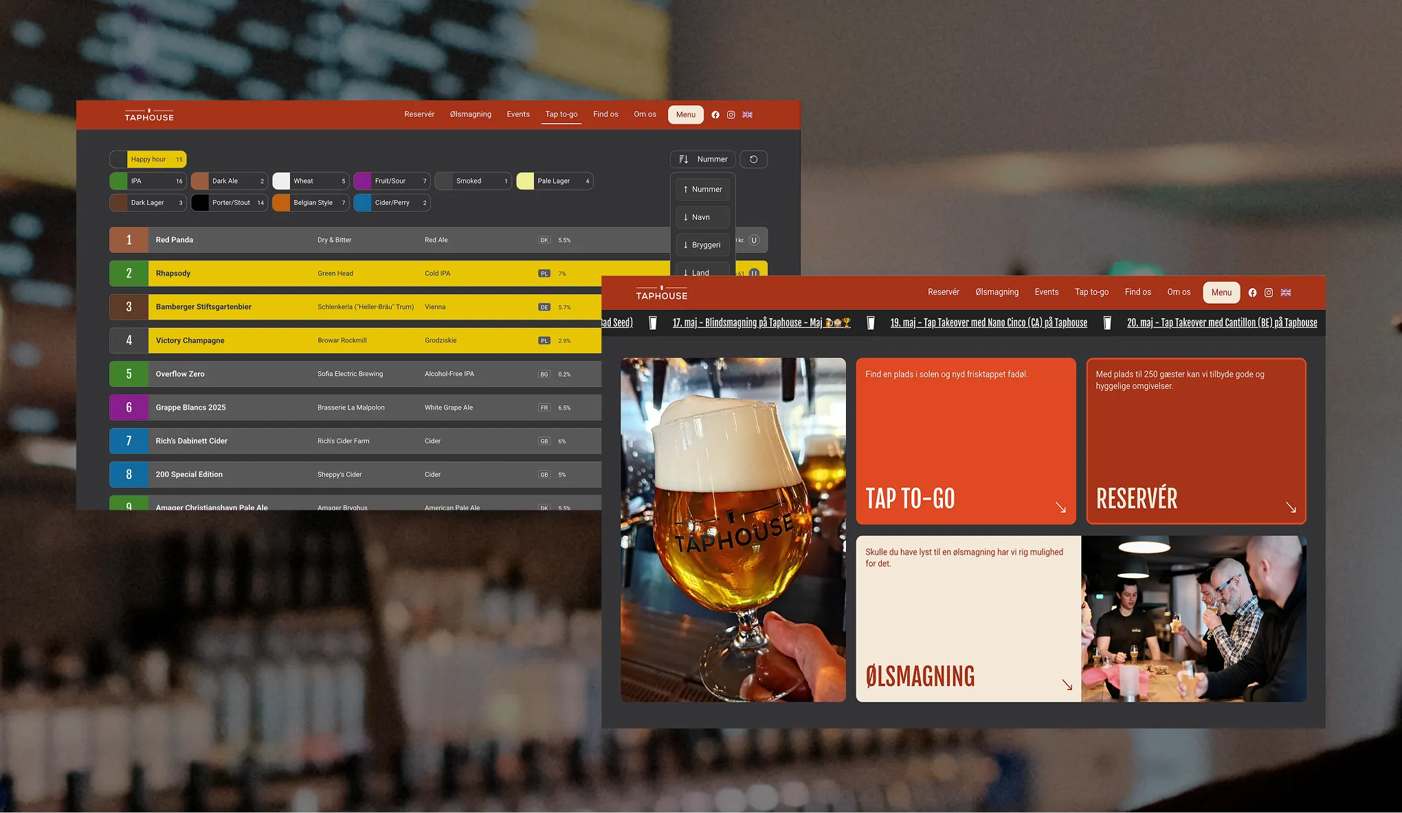
Kvalifik designed a complete new website for Taphouse and expanded its existing visual identity. The expanded identity gives the brand more personality and holds together better across the site. A new design system brought a stronger visual direction and updated layouts, and the redesigned website has a clearer structure and is easier to use. Together they give Taphouse a more modern and cohesive brand experience.
By agreeing on the goals first and exploring the visuals second. Kvalifik started the Taphouse project by aligning goals, user needs and the overall direction. Moodboards and a first design mockup then tested different visual directions and gave the project a shared creative foundation. With the direction in place, sitemaps and wireframes mapped the user journey, and a detailed visual prototype refined the layouts, interactions and design system.
Yes. Kvalifik built the final Taphouse website in Webflow and delivered clean, production-ready HTML and CSS that the Taphouse team could implement and develop further independently. With clearer navigation and a more flexible visual foundation, the site is better equipped to support guests and future growth.

The existing website had served Taphouse well over the years, but no longer reflected the atmosphere, ambition, or experience the bar is known for. The challenge was to create a modern digital experience that felt distinctive to the brand while improving usability across devices and making it easier for guests to navigate the site.
Expanded visual identity
An expanded visual identity that brings more personality, consistency, and flexibility to the brand.
Web design
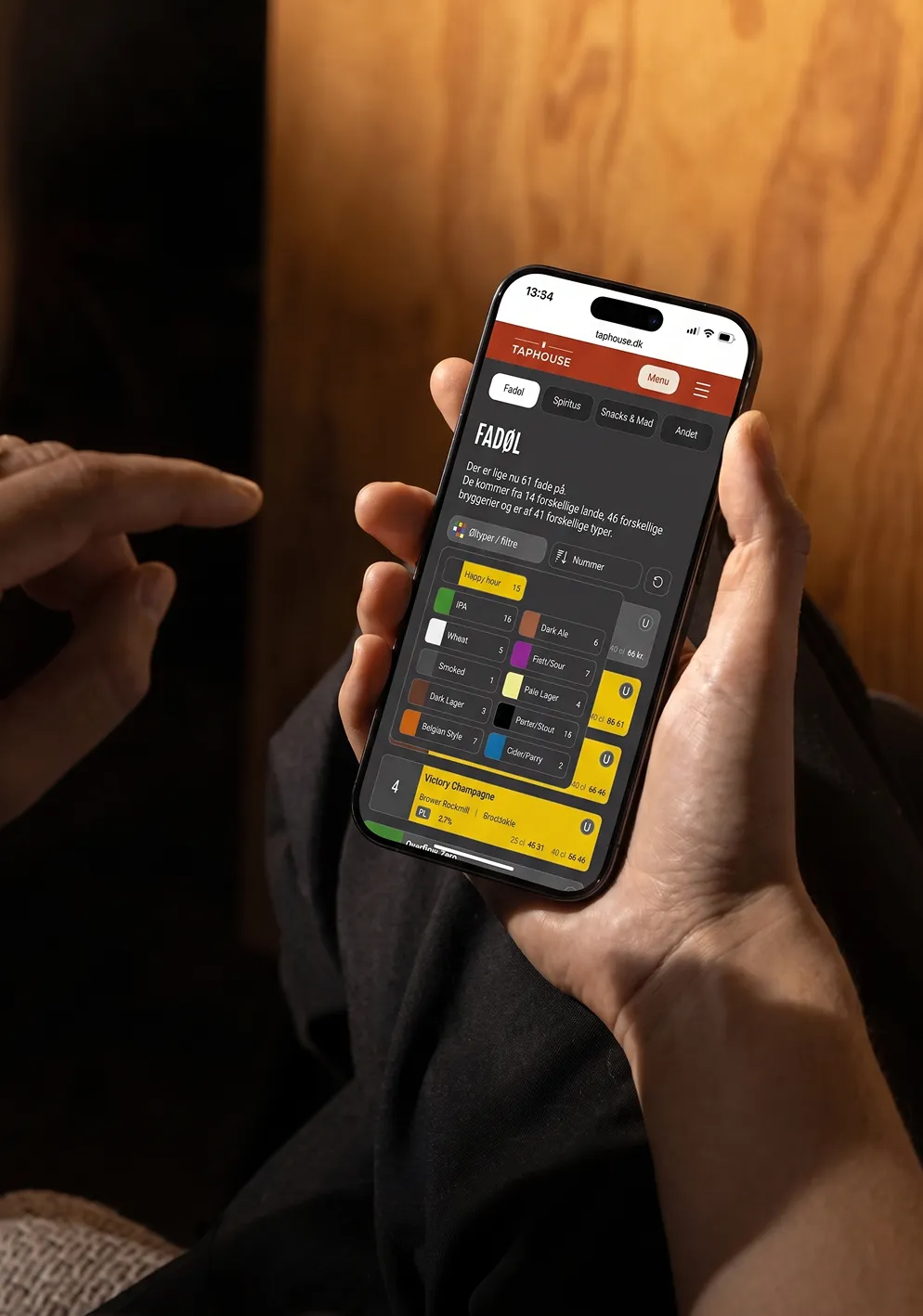
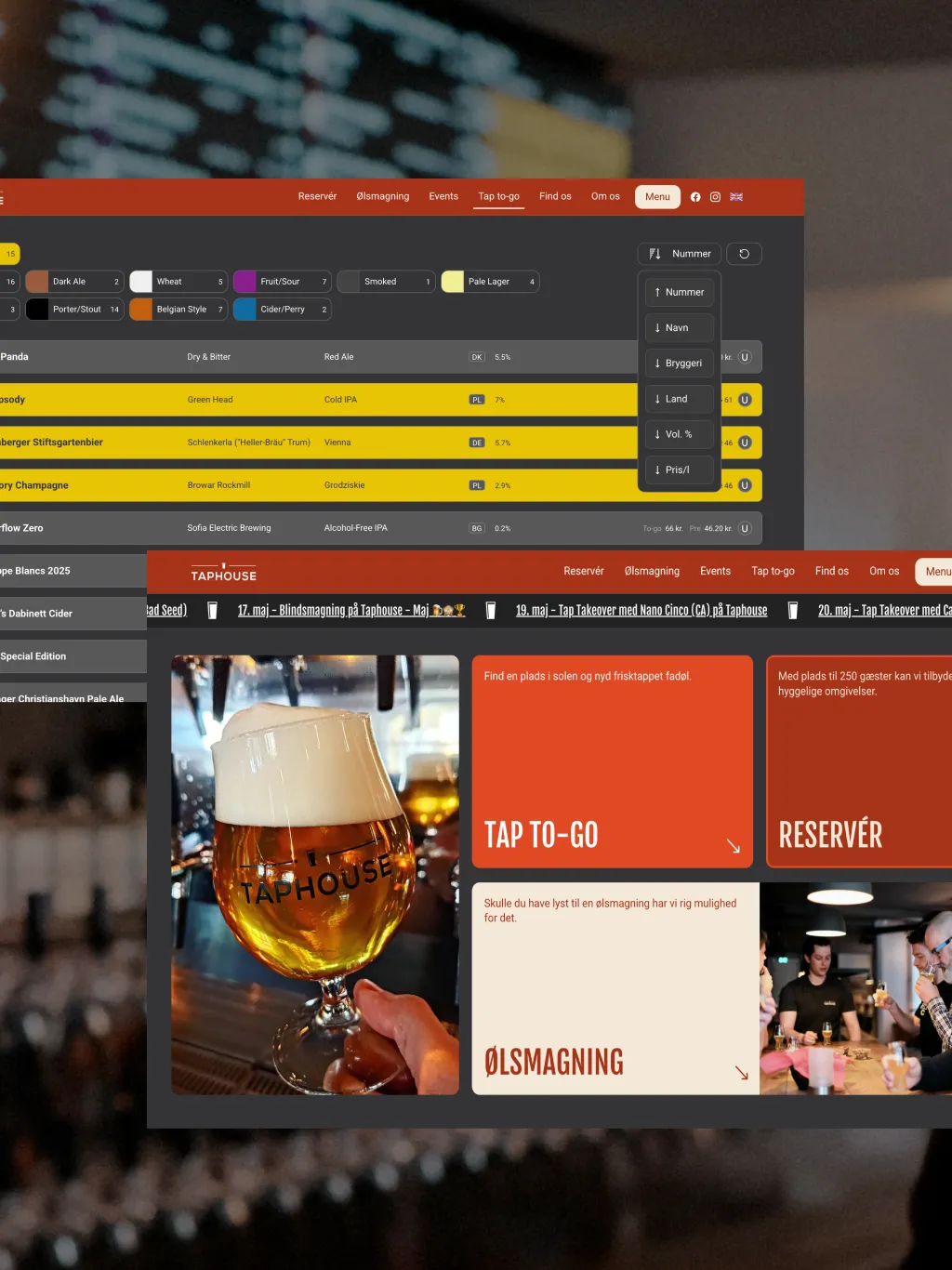
A redesigned website experience with improved structure, usability, and visual consistency.
The project began with aligning goals, user needs, and the overall direction for the new digital experience. From there, Kvalifik developed moodboards and an initial design mockup to explore different visual directions and establish a shared creative foundation. Once the direction was defined, the website structure was mapped out through sitemaps and wireframes, creating a clear and intuitive user journey across the site. Building on this foundation, a detailed visual prototype was developed to refine layouts, interactions, and the overall design system. The final website was built in Webflow, allowing Kvalifik to deliver clean, production-ready HTML and CSS that the Taphouse team could implement and further develop independently.
A redesigned website and expanded visual identity now give Taphouse a more modern, cohesive, and scalable brand experience. With improved structure, clearer navigation, and a more flexible visual foundation, the platform is better equipped to support both guests and future growth.
See other cases