A website that shows the people behind every chat

client quote
- Rebecca Busk
- Ana Carolina Rijo
- Francesca Tiziani
Because the old website didn't show what makes Weply different. Weply's chats are handled by trained people, yet the site felt static, generic and close to the AI chatbots it competes with. Weply wanted a clearer value proposition, a stronger position, more free trial sign-ups and more engaged visitors, and the old design couldn't deliver that.
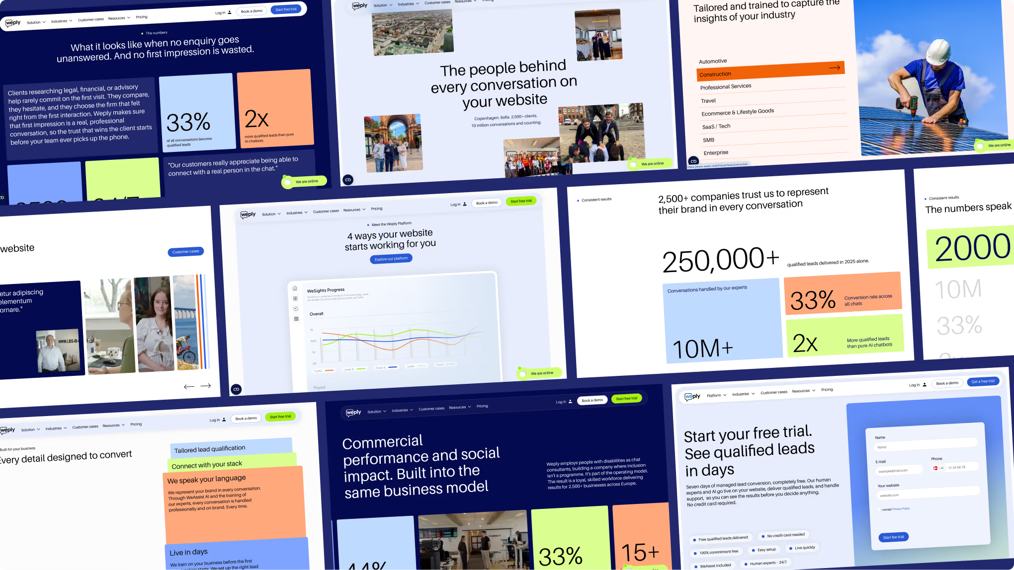
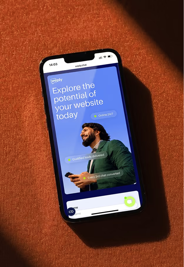
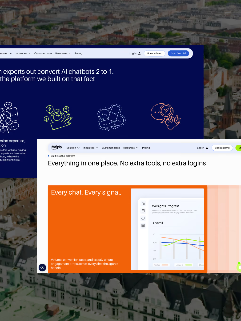
By showing the people and the product. On Weply's new website, photos of the real chat experts sit next to interface elements that show a conversation turning into a lead. Warm colors, custom illustrations and hand-drawn sketches replace the cold, minimal look most chatbot tools share, so visitors see a service run by people.
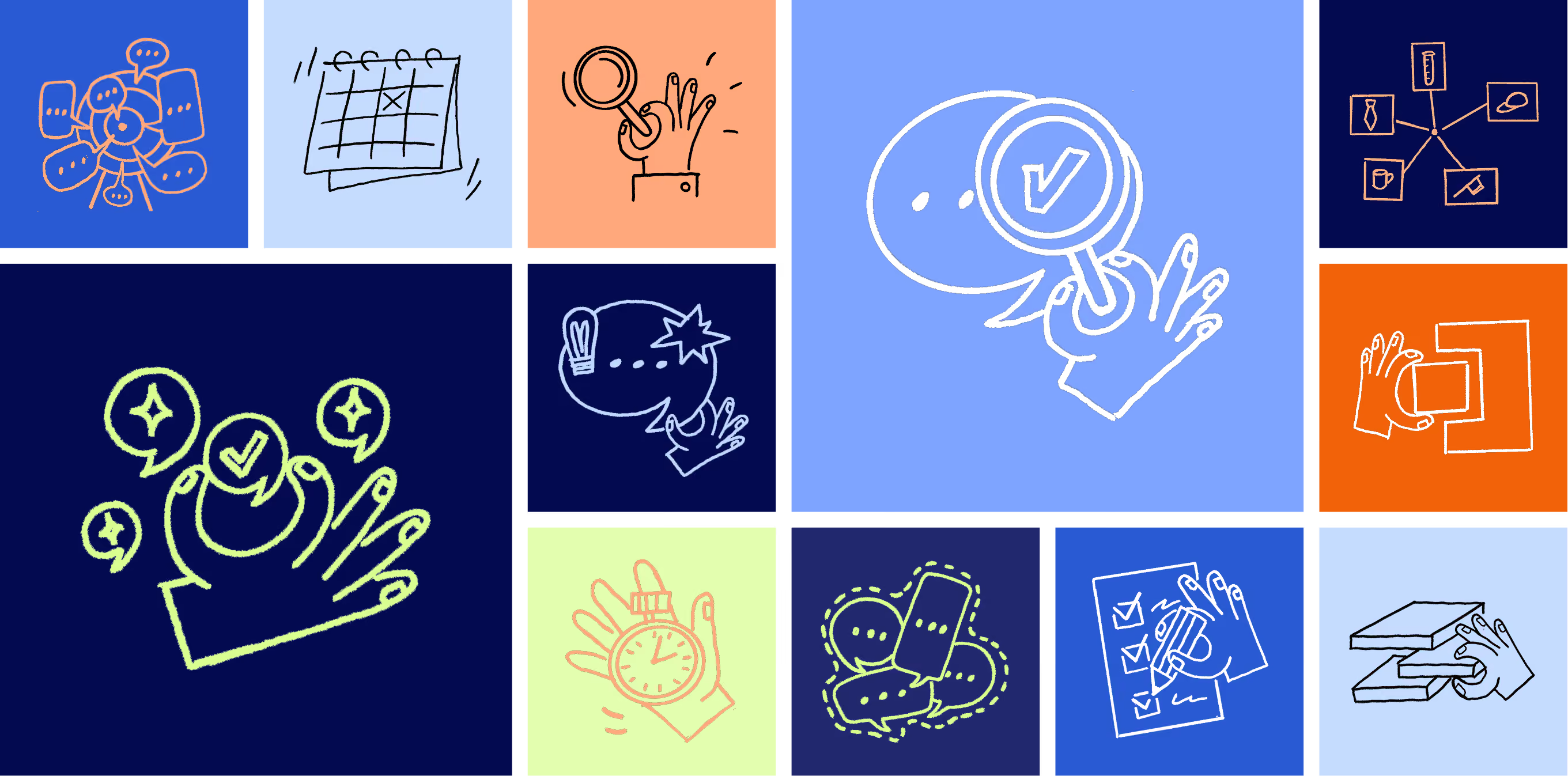
A wider color palette, custom illustrations, hand-drawn sketches and graphic elements taken from Weply's product. Orange, lime and yellow now work alongside Weply's blue, and chat bubbles, status labels and lead cards double as design elements. The illustrations and sketches are made for Weply alone and give the brand a personal touch other chat tools don't have. Weply's team now has far more to build with than a single color and a few high-quality photos.
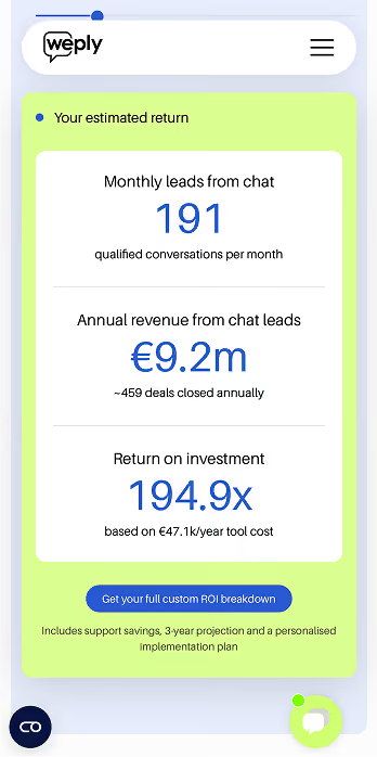
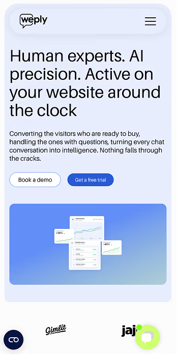
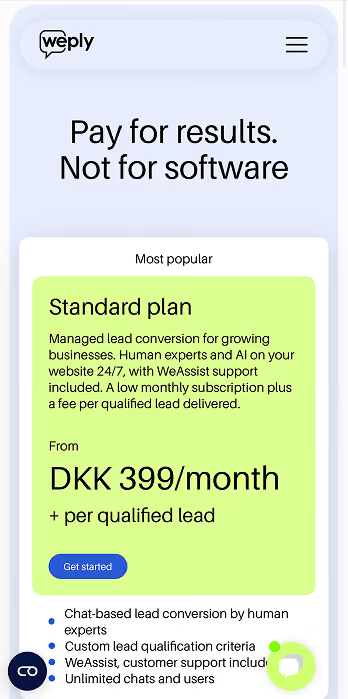
Every page leads to the free trial. Weply's value proposition comes first, followed by proof in the form of client logos, customer videos and large, colorful stats, such as one in three chats turning into a lead. Simple pricing based on qualified leads makes the next step easy to take on desktop and mobile.

- Digital Experience Design
- Illustrations
Weply connects website visitors with trained chat experts around the clock, and on average every third chat turns into a qualified lead.
Weply came to us with four goals for the new website: a clearer value proposition, a stronger position in the market, more sign-ups for the free trial and more engagement from visitors. At the core sat one idea. Weply's chats are answered by people, and the website should feel human enough to stand apart from the AI chatbot look that has taken over the category.
In our first workshop, the team was clear about what wasn't working. The site felt static, generic and too minimal, with no personality. Photos and icons were restrictive, the brand had few assets beyond high-quality images, and the color palette was limited. Strong numbers were hidden in plain text, and visitors couldn't see the chat in action before signing up.
The team also knew what to keep: the soft, rounded shapes, the client logos and videos, real human photos and a clear value proposition.
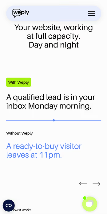
We started with the message. Each page opens with what Weply does and why it matters, in plain words, followed by proof: client logos, customer videos and Weply's own numbers, set in large, colorful blocks instead of hidden in paragraphs.
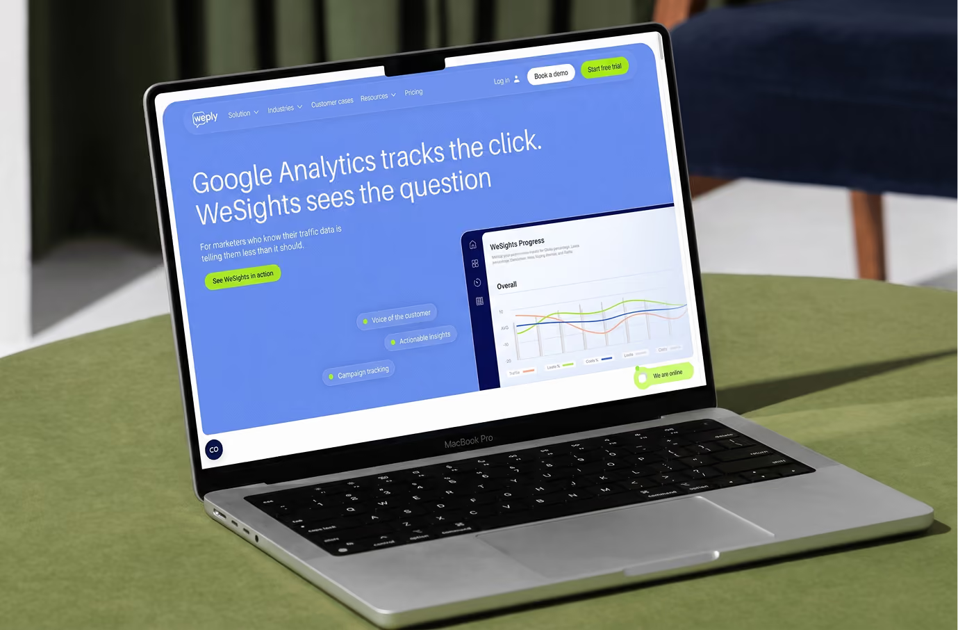
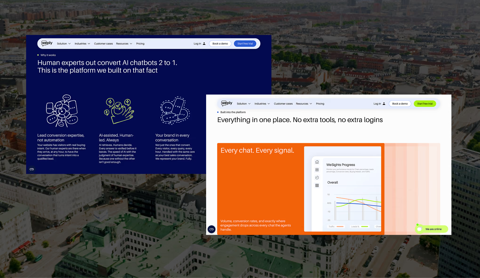
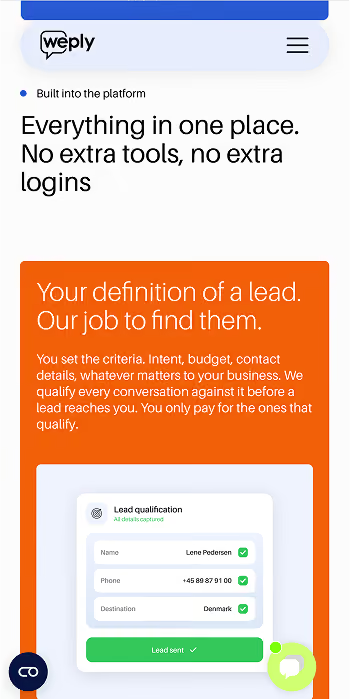
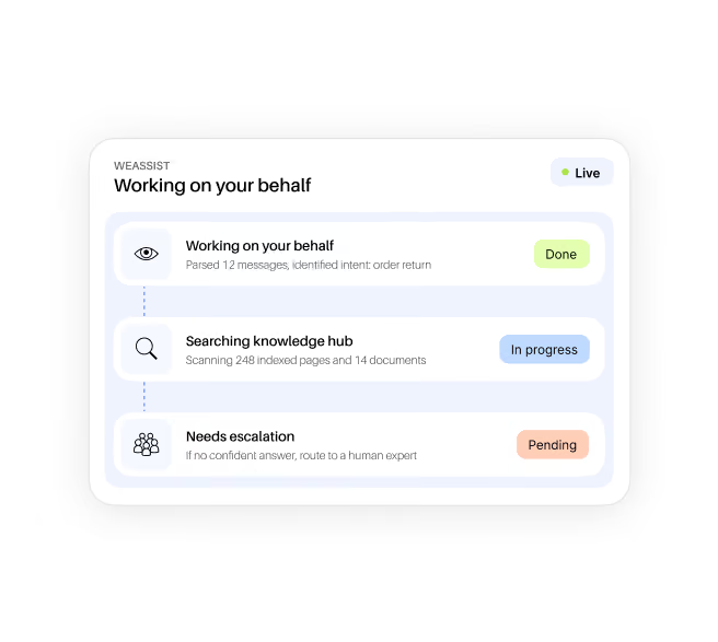
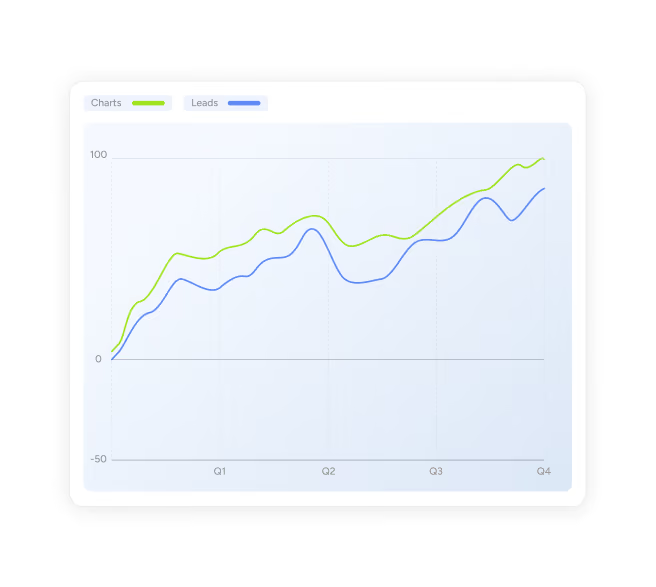
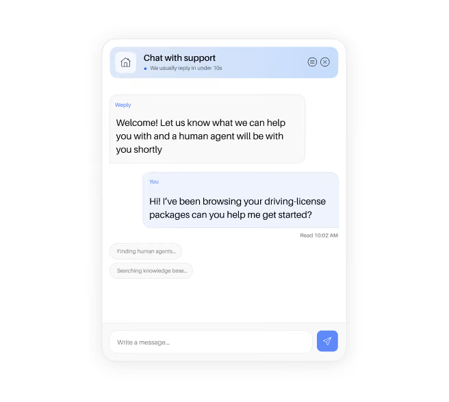
Then we made the product visible. Chat windows, lead qualification cards, WeAssist status updates and WeSights charts appear as interface elements throughout the site, so visitors can see how a conversation becomes a lead. Photos of the real people behind the chats sit next to them, replacing the stock-like images.
Every page leads to the same next step, the free trial, with simple pricing that says what you pay for: results. The rounded corners Weply liked stayed, now as part of a fuller design system that works on desktop and mobile.
Weply's brand needed more to work with than one blue and a few good photos. We expanded the palette with orange, lime and yellow, so pages, sections and stats can each get their own color without losing the Weply feel.
We made custom illustrations and hand-drawn sketches for Weply alone. They add the personal touch the old site was missing and make Weply stand out in a category where most tools look the same. Next to them sit graphic elements built from the product itself: chat bubbles, status labels and lead cards. Together they give Weply's team a toolbox for every new page that doesn't depend on finding the perfect image.
The result is a brand that looks as human as the service: warm, colorful and personal, and clearly different from the AI chatbots Weply competes with.
Every page leads to the same place: a free trial. The value proposition comes first, followed by proof in the form of client logos, customer videos and Weply's strongest numbers, such as one in three chats becoming a lead. Real photos of the people behind the chats replace the stock-like images.
A live chat service is hard to picture, so we show it. Chat windows, lead cards, WeAssist status updates and WeSights charts appear across the site as interface elements, so visitors see how a conversation turns into a lead before they sign up.
Weply's brand leaned on one blue and a handful of photos. We added orange, lime and yellow, plus custom illustrations and hand-drawn sketches made for Weply alone. They give every page a personal touch and make Weply easy to tell apart from other chat tools.
See other cases